
There’s a reason certain color combinations stop you mid-scroll. Not just pretty — electric. Like whoever assembled that palette understood something deeply personal about how color speaks before words do. That reaction isn’t random. It’s the product of hue relationships, tonal contrast, saturation, and the invisible emotional grammar that color theory has been mapping for centuries — converging into something that doesn’t just dress the body, but signals something true about the person wearing it.
Color is the first thing people notice. And the last thing they forget.
The formal study of color in fashion traces back to Michel Eugène Chevreul’s 19th-century work on simultaneous contrast — the discovery that colors change appearance based on what sits beside them. That principle still governs every palette decision a designer makes today, whether they’re building a capsule collection or selecting a single outfit. Meanwhile, the psychology of color in personal dressing was brought to mainstream audiences through Carole Jackson’s iconic Color Me Beautiful system in the 1980s, which introduced seasonal color analysis to millions of women and permanently shifted how consumers think about wardrobe color strategy. Today, the landscape has expanded dramatically: Vogue’s color dressing features consistently rank among their most-shared fashion content, reflecting an enduring — and growing — appetite for understanding the mechanics behind what to wear and why it works.
This guide documents 135+ types of color palettes for women’s clothing across 8 classification systems. For every single entry:
-
Palette Identity
What it looks and feels like
-
Season
When it lands best
-
Best For
Occasions & styling contexts
Start here. Whether you’re building a capsule wardrobe or styling a single outfit, this is the most complete color palette reference for women’s clothing available — organized around how color actually works in dressing, not just how it looks on a mood board. Explore our full women’s clothing visual guide alongside it.
All 8 Categories at a Glance
A structured breakdown of the 135+ color palette types documented in this guide.
- 01
By Tonal Relationship
- 02
By Color Temperature
- 03
By Mood / Aesthetic
- 04
By Seasonal Color System
- 05
By Occasion / Dress Code
- 06
By Cultural / Regional Origin
- 07
By Trend Cycle
- 08
By Wardrobe Strategy
135+ Different Types of Color Palettes for Women’s Clothing
Category 1: By Tonal Relationship (#1–#24)
How colors relate to each other in value, saturation, and hue contrast — the structural logic of any palette
Tonal relationship is the architecture of a palette. Before a color has a mood, a season, or a cultural reference — it has a structural relationship with every other color it shares space with. Are the values close or contrasting? Is the saturation uniform or varied? Does the hue family stay narrow or spread wide? These 24 palette types represent the foundational how of color combination: the mechanics underneath every instinct you've ever had about whether something "works."
What works beautifully about this classification is that it transcends trend language entirely. A "coastal grandmother palette" is marketing. An analogous low-saturation sequence in blue-green-cream? That's tonal logic — and that logic tells you exactly how the outfit will read in natural light, how it will photograph, and how much visual effort the wearer will appear to be making. Tonal structure is the information that actually matters when building outfits that feel considered rather than assembled. For everything you need to know about how those colors connect to actual garments, our full women's tops visual reference and our deep-dive on silhouettes and how color interacts with them both complement this guide directly.
- 01
Monochromatic Palette

A single hue used across multiple shades, tints, and tones within one outfit or wardrobe capsule. The depth comes entirely from value variation — from palest cream through to deepest navy within a single blue family, say. It's not boring. It's precise. The optical effect creates a long, unbroken vertical line, making this one of the most lengthening palettes in practical dressing.
- 02
Analogous Palette
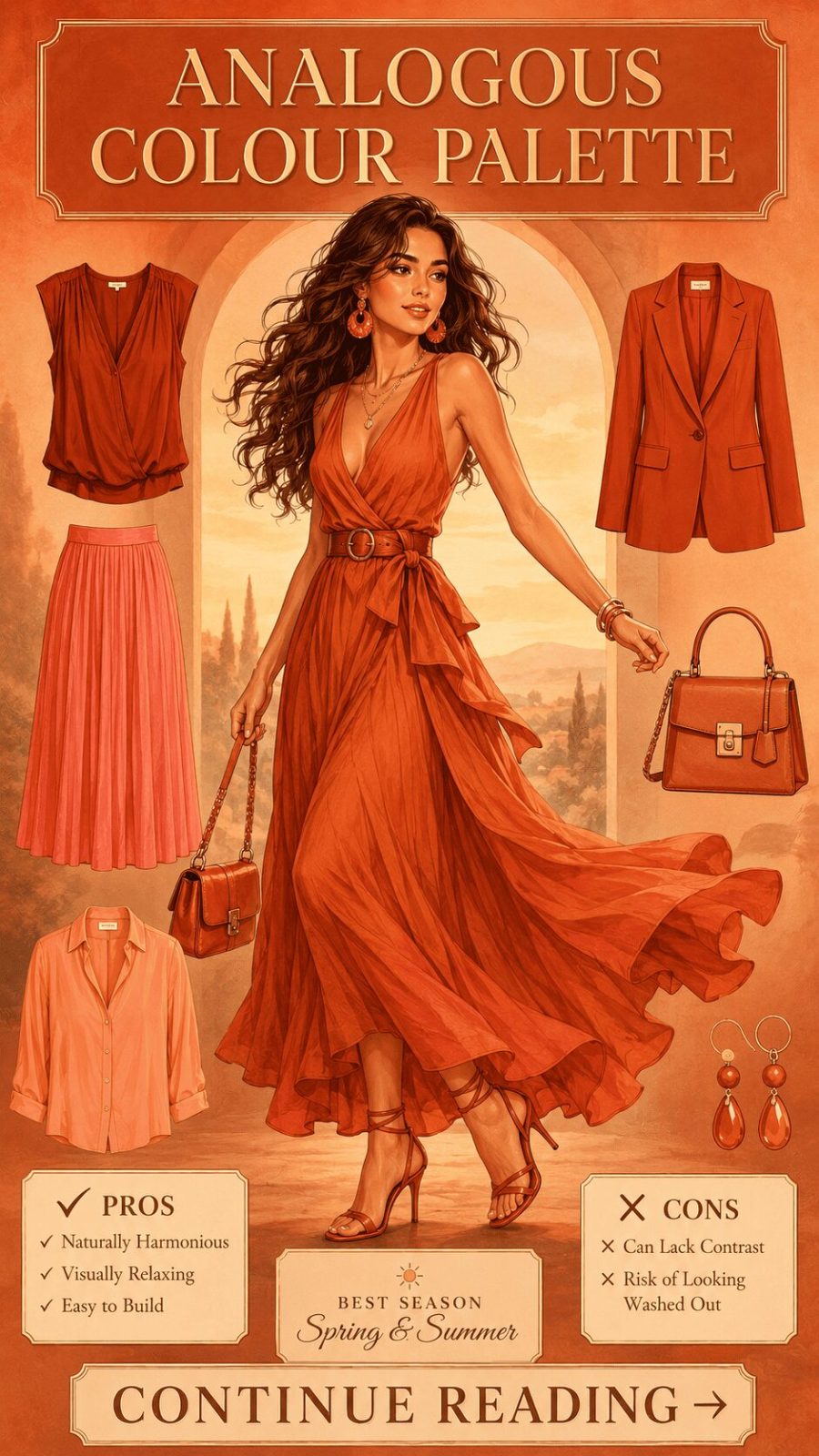
![Analogous Color Palette Women's Clothing]()
Colors that sit adjacent on the color wheel — typically three to five hues spanning a 60–90° arc. Think rust, terracotta, and burnt orange together. The palette feels naturally harmonious because the hues share a common undertone family. In wardrobe terms, analogous dressing is the approach most master stylists use when building outfits that feel effortlessly cohesive without being predictably matchy.


- 03
Complementary Palette
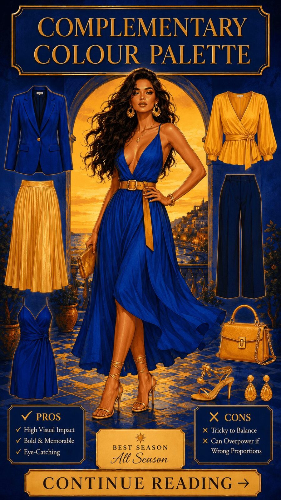
![Complementary Color Palette Women's Clothing]()
Two colors positioned directly opposite each other on the color wheel — blue and orange, red and green, purple and yellow. The tension between them creates maximum visual contrast and mutual intensification. In dressing, complementary palettes read as bold and confident. Used in equal proportions they can feel jarring; the styling trick is to let one color dominate (roughly 70%) while the other accents (30%), maintaining energy without visual chaos.
- 04
Split-Complementary Palette
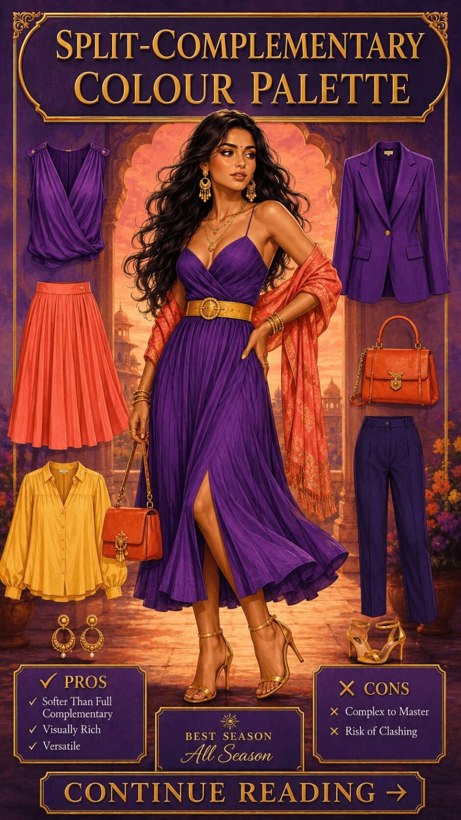
![Split Complementary Color Palette Clothing]()
One base hue paired not with its direct complement but with the two colors flanking that complement. Blue paired with yellow-orange and red-orange, for instance. The visual result retains significant contrast and visual interest but softens the confrontational tension of a pure complementary pair. In wardrobing this reads as confidently colorful without the polarizing edge — versatile enough for daytime wear where a straight complementary combination might feel too aggressive.
- 05
Triadic Palette
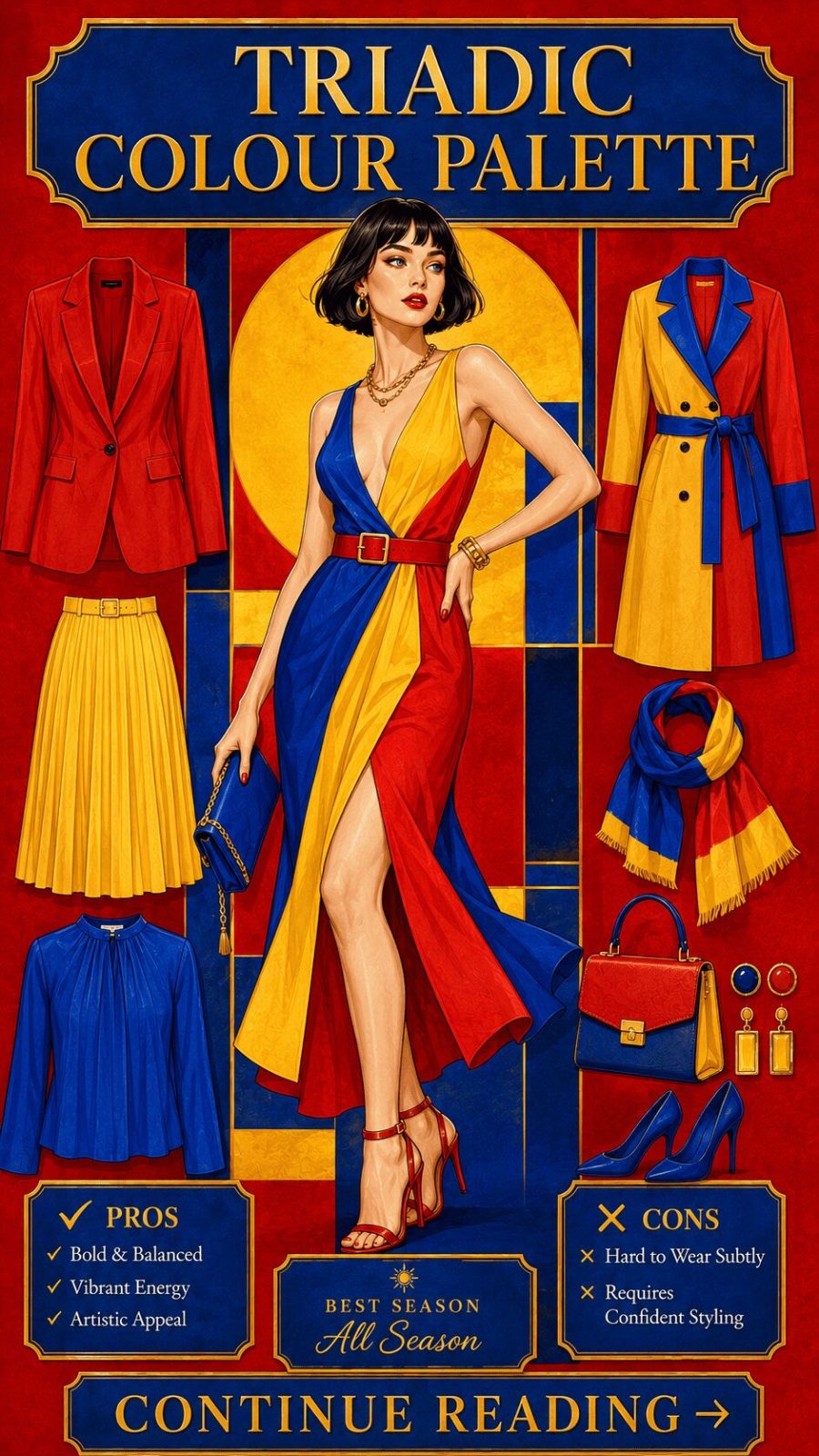
![Triadic Color Palette Women's Clothing]()
Three colors spaced evenly around the color wheel — forming a perfect triangle. Red, yellow, and blue is the classic example; violet, orange, and green another. In fashion, triadic palettes read as playful, dynamic, and visually energetic. This is the palette system behind many maximalist dressing approaches. It requires genuine editorial confidence to execute in clothing because equal visual weight across three contrasting hues can easily tip into costume territory if proportions aren't carefully managed.
- 06
Tetradic / Double Complementary Palette
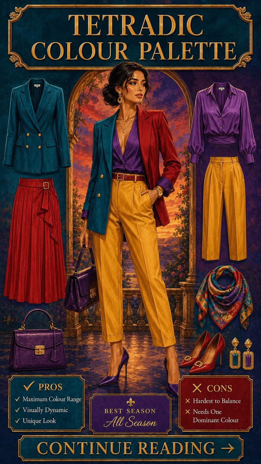
![Tetradic Color Palette Women's Clothing]()
Two complementary pairs combined — forming a rectangle or square on the color wheel. Four distinct hues in conversation. This is complex territory in fashion; most successful tetradic dressing uses one hue as dominant ground, one as secondary, and the remaining two as accent only. The reward is exceptional visual richness. The risk is visual clutter — which is why this palette appears most reliably in print-led garments rather than solid-color ensembles.


The most common palette mistake I see isn't choosing the wrong colors — it's ignoring proportion. Two complementary hues in equal amounts create visual noise. The same two colors at 70/30 create effortless contrast. Before changing your palette entirely, try adjusting the ratio of what you're already working with. It's the single cheapest, fastest styling upgrade available. And it changes everything.
- 07
Neutral Palette
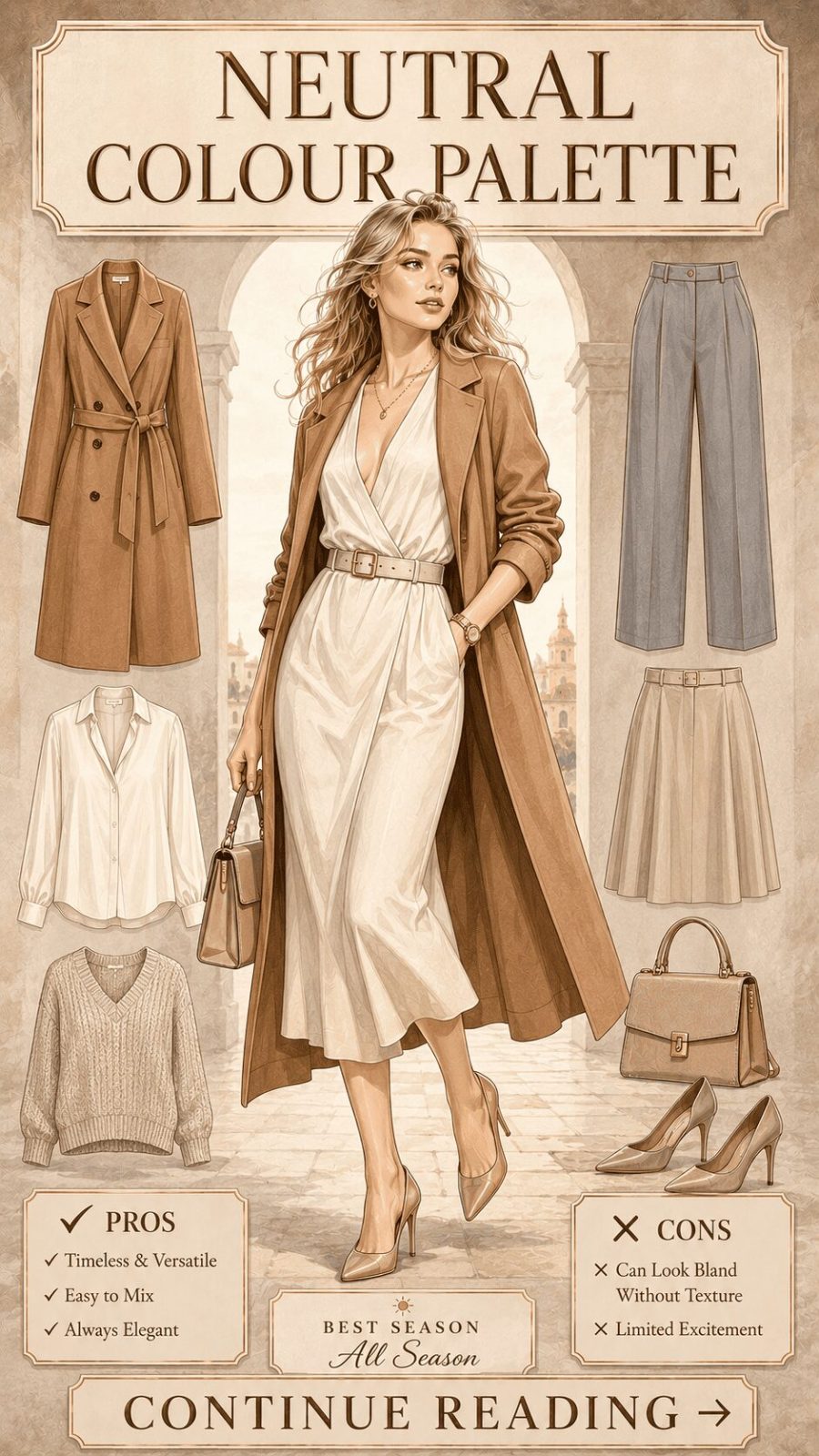
![Neutral Color Palette Women's Clothing]()
Beige, ivory, camel, taupe, stone, grey, and white assembled without any saturated color present. The power of a neutral palette is entirely in texture and proportion — with no hue contrast to do the visual work, fabric becomes the star. A cashmere cream sweater next to a linen sand trouser and a cognac leather belt? That's a neutral palette at its best. It reads as effortlessly polished, which is probably why it dominates workwear capsule wardrobe recommendations year after year.
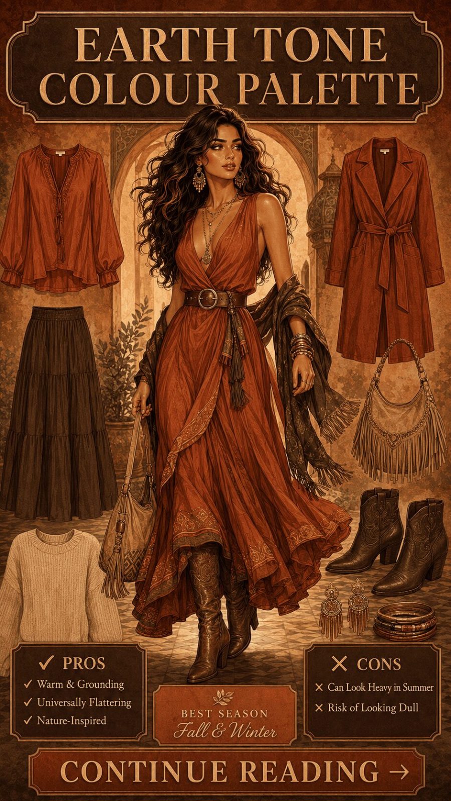
- 08
Earth Tone Palette
![Earth Tone Color Palette Women's Clothing]()
Ochre, sienna, umber, khaki, forest green, clay red, and warm brown — the colors of unprocessed natural materials. Distinct from a neutral palette in that earth tones retain genuine hue identity; they're just deeply muted versions of their saturated counterparts. In wardrobing, earth tones read as grounded and approachable. They work across a wider range of skin tones than cool neutrals, and they photograph beautifully in natural outdoor light — which partly explains their consistent dominance in autumn fashion editorials.
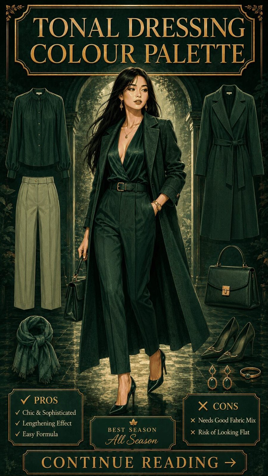
- 09
Tonal Dressing Palette
![Tonal Dressing Color Palette Women's Clothing]()
Close-in-value colors across multiple hues — the distinction being that tonal dressing allows subtle hue shifts where pure monochromatic dressing stays within a single hue family. Ivory, soft blush, and pale lilac together — technically three different hues but all sitting at similar pale tonal values. The result is a quiet, layered sophistication that photographs with an almost painterly quality. This is probably the most technically nuanced category in this guide, and also — genuinely — the one that most rewards deliberate practice.
- 10
High Contrast Palette
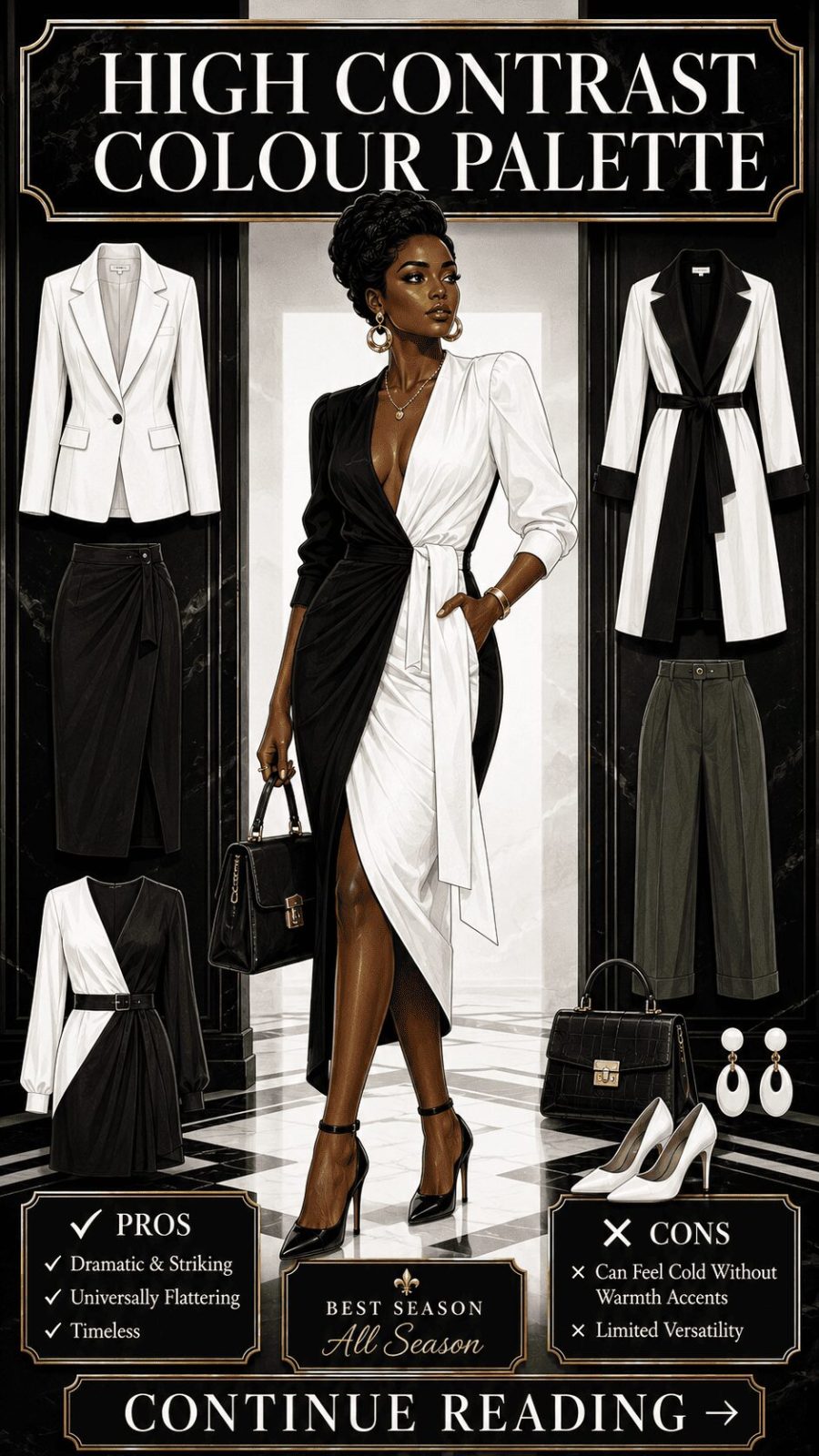
![High Contrast Color Palette Women's Clothing]()
Colors at extreme ends of the value scale paired together — black and white being the most definitive example, but also deep navy with bright cream, rich burgundy with stark ivory. The eye reads high contrast pairings as crisp, decisive, and authoritative. This is the palette language of power dressing — and one reason black-and-white combinations have remained consistently relevant across decades when so many other palette trends have cycled through. It simply never stops reading as confident.


- 11
Pastel Palette
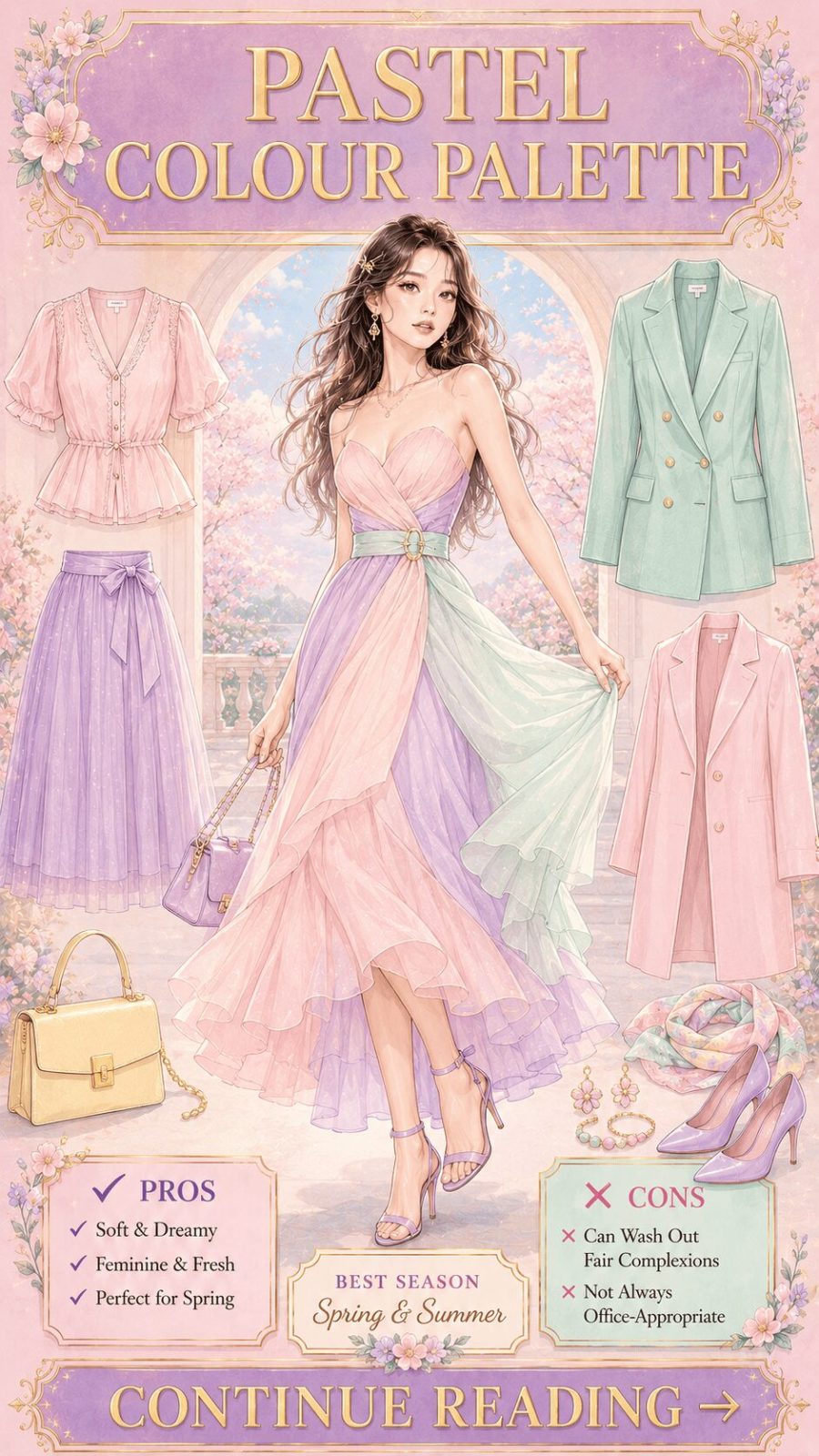
![Pastel Color Palette Women's Clothing]()
Pale, soft, heavily tinted colors — baby pink, mint, lavender, powder blue, buttercup yellow. Technically, pastels are any color with white added to reduce saturation and lift value. In wardrobing, they're associated primarily with spring, femininity, and lightness. But — and this matters — pastels used in unexpected combinations (lavender with sage, dusty rose with warm grey) read as sophisticated rather than sugary. The difference between a pastel outfit that looks expensive and one that looks juvenile is usually confidence in the pairing and quality of fabric.
- 12
Muted / Dusty Palette
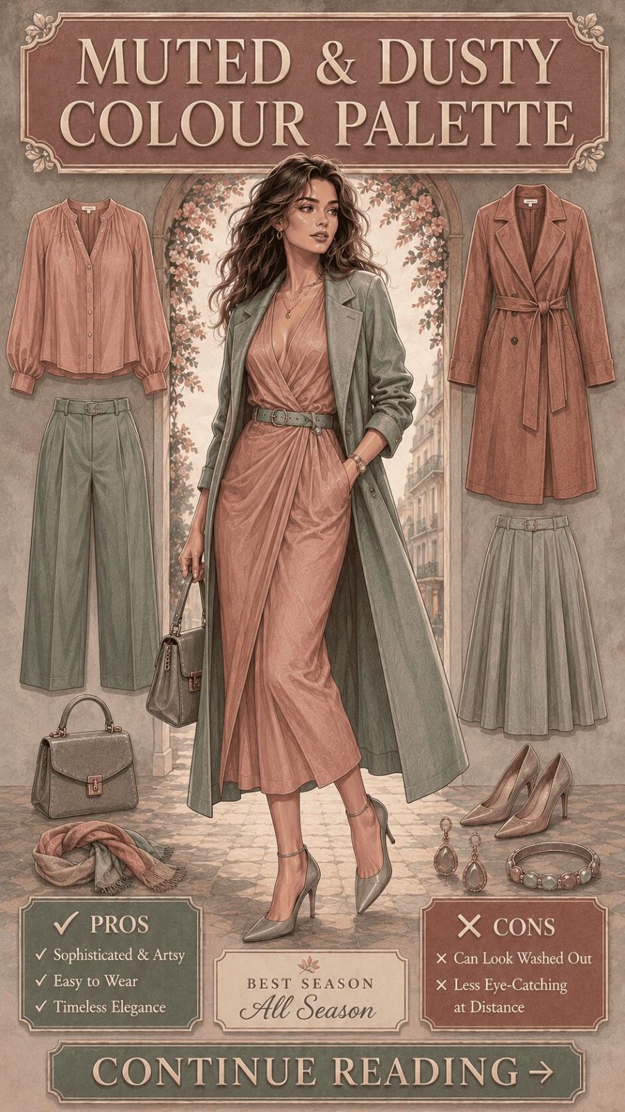
![Muted Dusty Color Palette Women's Clothing]()
Colors that have been desaturated by the addition of grey — what color theorists call "tones" (hue + grey). Dusty rose, sage green, slate blue, muted mauve. Unlike pastels, muted tones don't feel light — they feel complex, like colors that have been worn in slightly and carry a certain history. This is the aesthetic register that underpins most "quiet luxury" wardrobe approaches, and it's consistently favoured in premium fashion because the low saturation reads as restrained and considered rather than understated from lack of effort.
- 13
Jewel Tone Palette
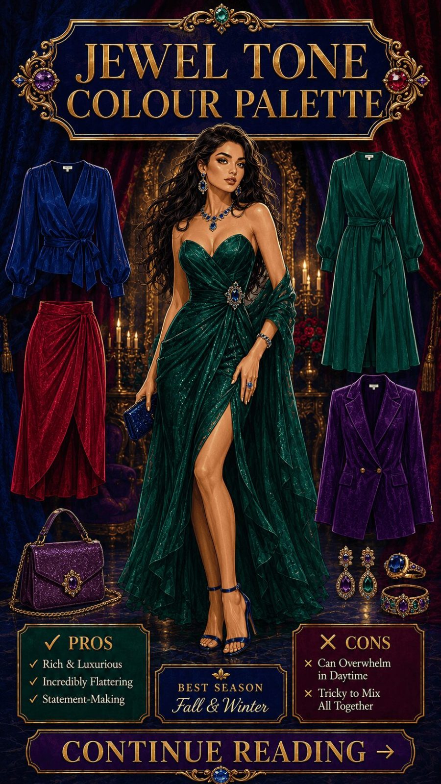
![Jewel Tone Color Palette Women's Clothing]()
Deep, fully saturated colors named for precious and semi-precious stones: emerald, sapphire, ruby, amethyst, topaz, jade. These are colors at peak saturation and medium-to-deep value — no white, no grey, no black diluting them. In wardrobing, jewel tones read as deeply luxurious and particularly effective at lower ambient light levels, which makes them the dominant palette for evening dressing, autumn parties, and formal occasions. They also tend to appear highly flattering against a wide range of skin tones because of their depth and richness.
- 14
Neon / Electric Palette
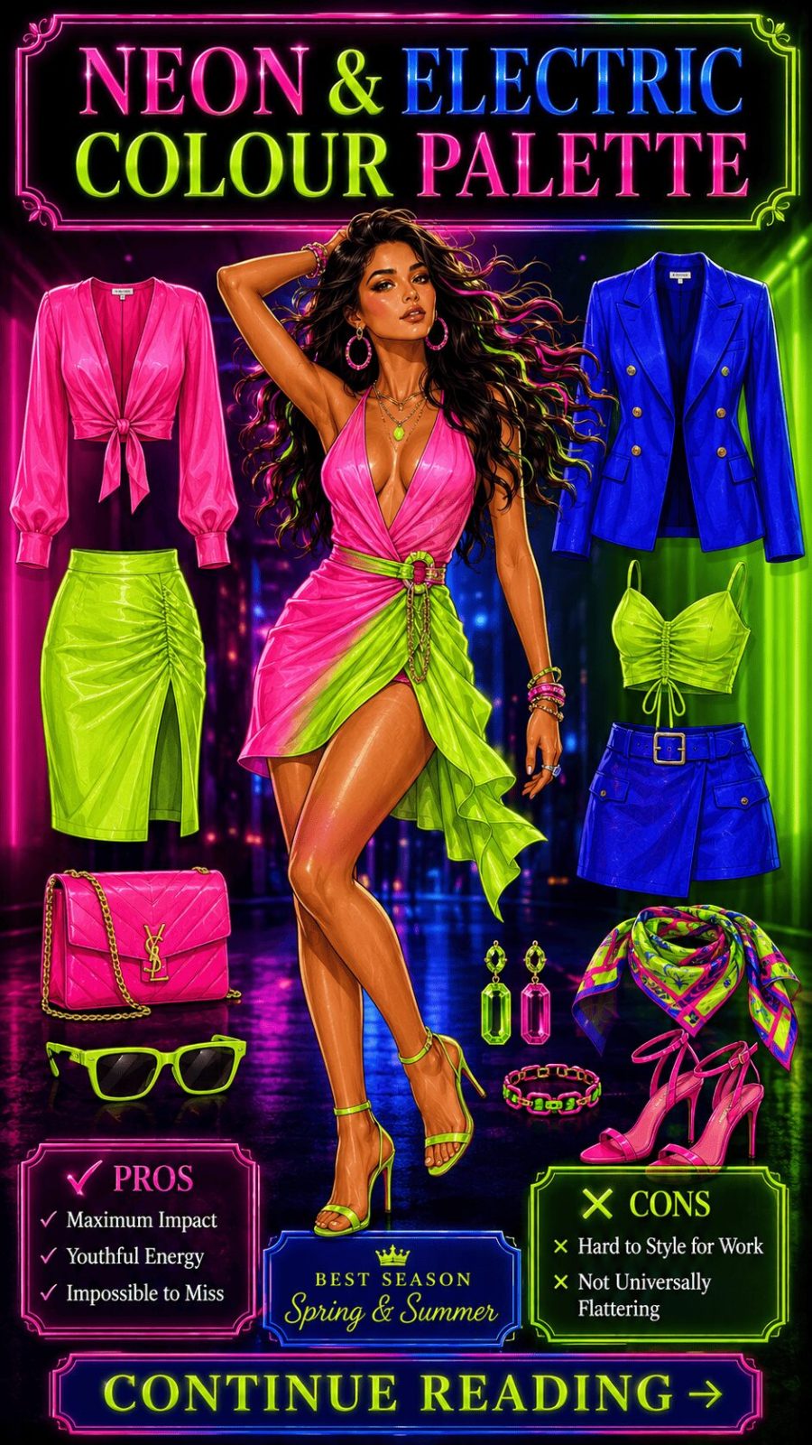
![Neon Electric Color Palette Women's Clothing]()
Ultra-saturated, fluorescent, or artificially vivid colors that appear to "glow" visually — electric lime, hot pink, neon orange, vivid cyan. These are colours that exceed natural pigment saturation and were historically produced only through synthetic dyes and fluorescent compounds. In fashion, neon palettes cycle through trend peaks roughly every decade, with the most recent major wave running through 2019–2022. Their enduring subcultural home is streetwear, clubwear, and activewear — contexts where visual visibility is part of the function rather than incidental.


- 15
Dark / Shadowed Palette
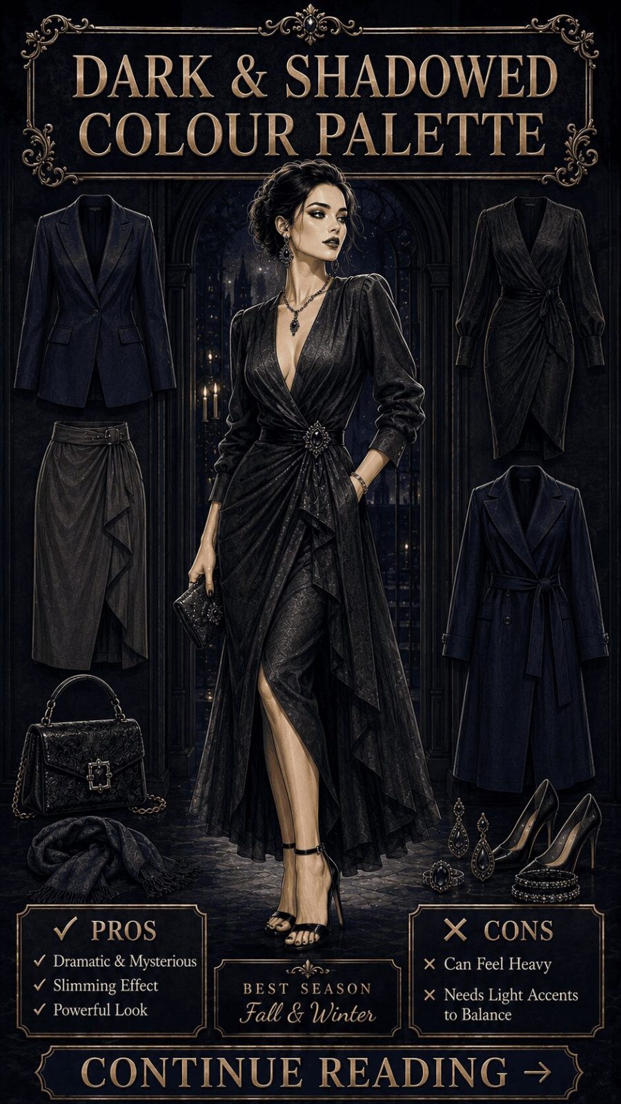
![Dark Shadowed Color Palette Women's Clothing]()
Deep, shade-heavy colors — blacks, charcoals, oxblood, midnight navy, deep forest, near-black purple. Technically these are colors with significant black added, reducing value to the lower end of the spectrum while retaining underlying hue identity. In wardrobing, dark palettes read as authoritative, mysterious, and seasonally powerful. The most wearable dark palettes include at least two different dark hues to create textural variation — all-black head to toe requires exceptional fabric quality and fit to avoid flatness.
- 16
Warm-Saturated Palette
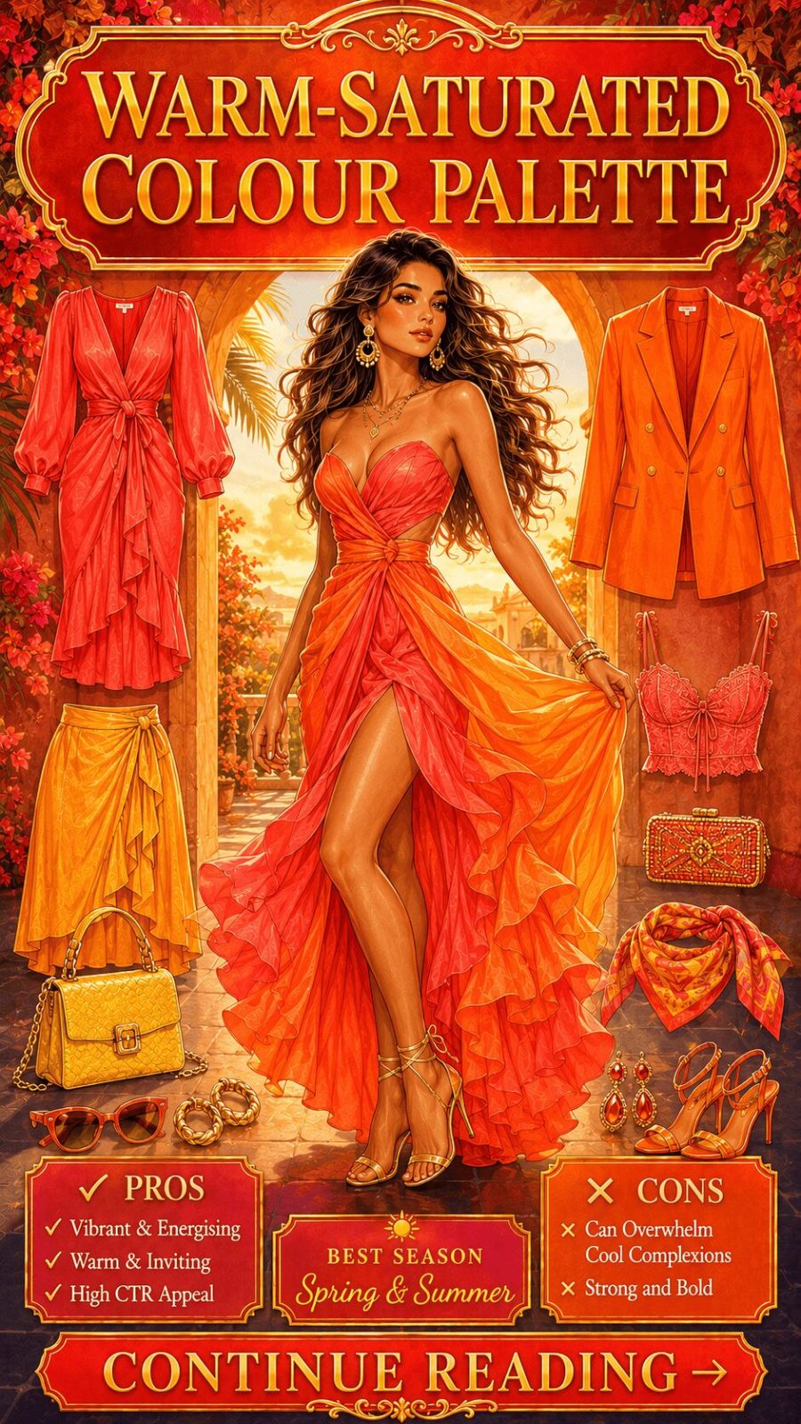
![Warm Saturated Color Palette Women's Clothing]()
Fully saturated warm hues — tomato red, saffron yellow, burnt orange, coral, paprika. These are colors with genuine temperature: they radiate visual heat and tend to advance visually (appear closer to the viewer). In fashion, warm-saturated palettes dominate summer and resort markets for this very reason — they read as energetic, sun-drenched, and celebratory. Against warm skin tones, they're particularly effective. Against cool skin tones, they create interesting contrast rather than harmony — which can be equally compelling when that's the intention.
- 17
Cool-Saturated Palette
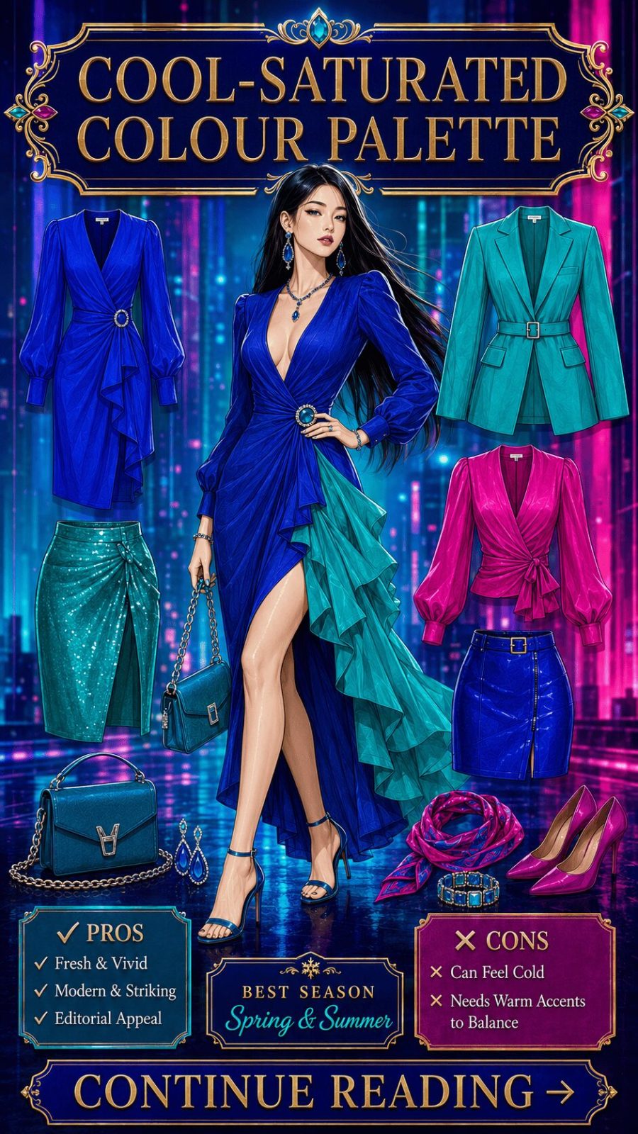
![Cool Saturated Color Palette Women's Clothing]()
Saturated cool hues — electric blue, cobalt, vivid emerald, cerulean, magenta. These sit on the blue, green, and purple arc of the wheel at high saturation. Where warm-saturated colors advance, cool-saturated colors recede visually — which creates a different kind of impact: calm confidence rather than energetic vivacity. In fashion contexts, cool-saturated palettes appear heavily in professional wear because they read as focused, credible, and composed, while still communicating genuine color personality. Cobalt blue in a workwear context is one of the most consistently effective single-hue choices in contemporary office dressing.
- 18
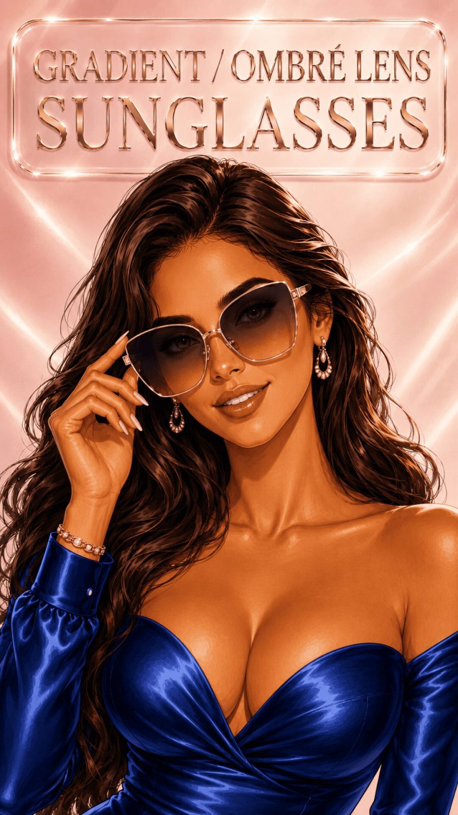
Gradient / Ombré Palette
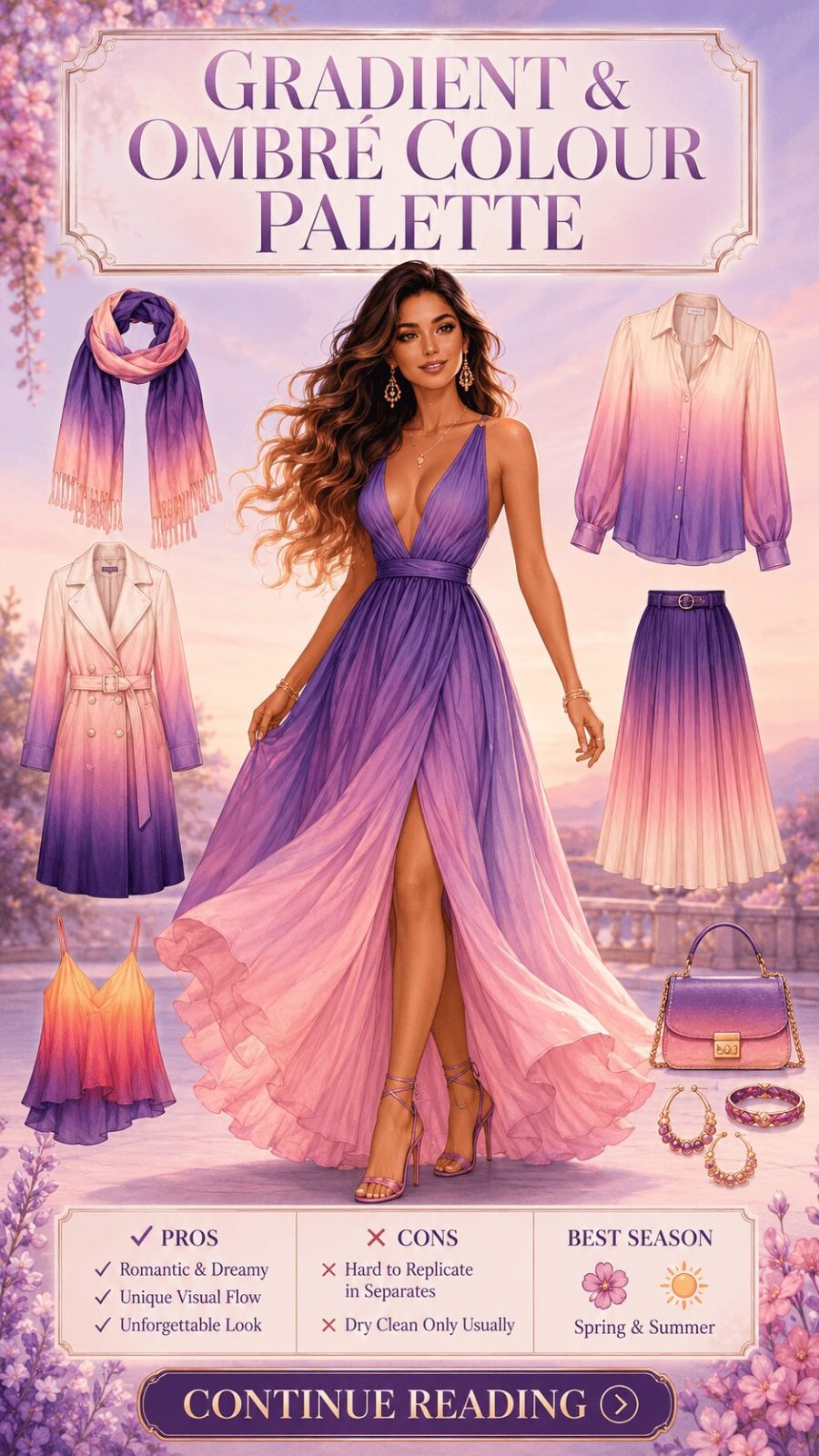
![Gradient Ombré Color Palette Women's Clothing]()
A continuous color transition within a single garment or across an outfit — from dark to light, from one hue to another, from saturated to pale. Technically this appears most often as a dyeing technique in individual pieces (tie-dye, dip-dye, ombré fabric), but it also describes how a well-constructed outfit can create a gradient effect through deliberate piece selection — palest tone at the top, deepest at the hem, for instance. The visual effect creates beautiful movement and a sense of the garment "transitioning" in a way that flat color never achieves.


- Tonal relationship is the structural logic of a palette — it determines how an outfit reads at a distance before anyone sees the specific colors
- Proportion rule: no complementary palette works at 50/50 — dominant color (70%) + accent color (30%) is the reliable starting point
- Muted ≠ neutral: muted tones retain real hue identity, just grey-softened — they read as sophisticated, not dull
- High contrast palettes — especially black and white — are genuinely timeless because they communicate decisiveness, not trend following
Category 2: By Color Temperature (#19–#42)
Warm versus cool, and all the nuanced positions in between — the thermal dimension of every palette
Color temperature is where personal dressing gets genuinely personal. Not every warm color looks equally good on every person — and not because of some prescriptive rule about skin tone. Because undertone interaction is real, visible, and worth understanding. Colors in the warm arc (reds, oranges, yellows, warm greens) tend to draw out warmth in complexion. Colors in the cool arc (blues, purples, blue-greens, true reds with blue bias) interact differently. But context, intensity, and specific hue all modify this interaction — which is why blanket rules fail and individual exploration works.
- 19
Warm White Palette
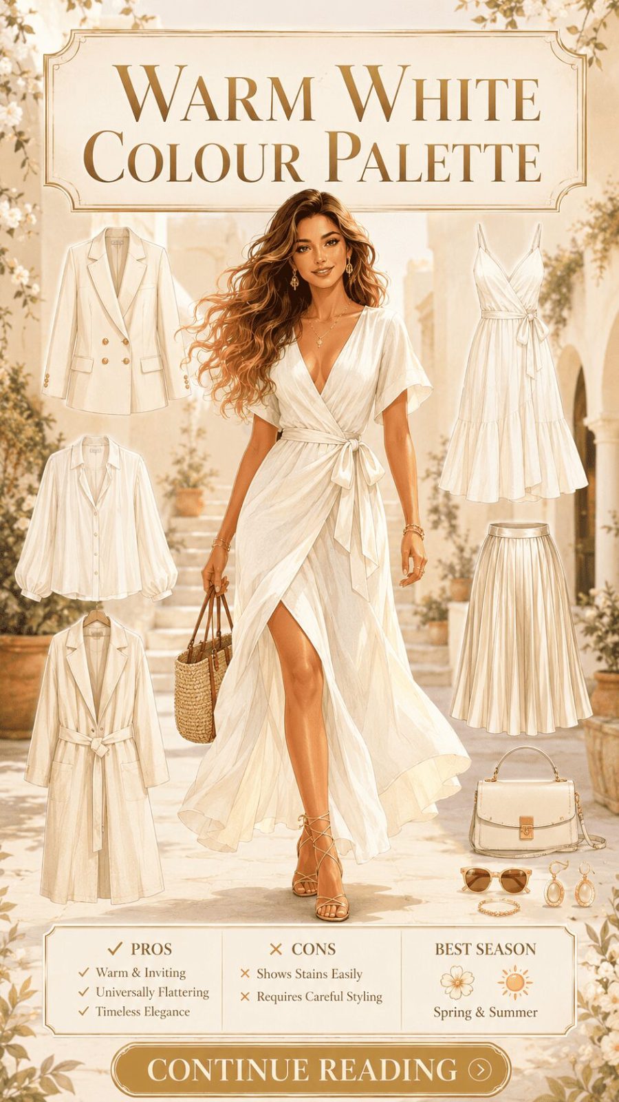
![Warm White Color Palette Women's Clothing]()
Ivory, cream, off-white, warm linen white — whites with a yellow, peachy, or golden bias. This is a fundamentally different palette register from pure brilliant white, even though the distinction sounds minimal until you're standing in a dressing room comparing the two. Warm whites tend to look softer and more organic against skin, which is partly why ivory became the dominant bridal choice in mainstream Western fashion — it's the white that photographs more warmly and reads as less stark against most complexions.
- 20
Cool White Palette


Pure, brilliant, or blue-biased white — stark, clean, and optically sharp. Where warm white reads as organic and soft, cool white reads as crisp and precise. It's the white of surgical precision in fashion — tailored white shirts, minimalist summer dresses, architectural separates. It can read as clinical in excess (all-cool-white head to toe can feel severe), but deployed correctly it's the most powerful clean-slate color in a wardrobe — the one that makes everything else look considered by contrast.
- 21
Warm Neutral + Color Pop Palette
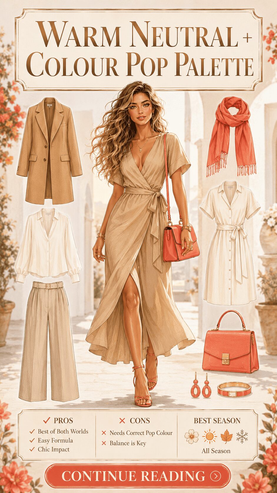
A base of warm neutrals (camel, cream, sand, terracotta) with a single saturated color accent — a cobalt bag, a poppy red lip-matching scarf, a chartreuse belt. This is one of the most commercially reliable palette formulas in women's fashion because it delivers both wearability and visual interest simultaneously. The neutrals provide outfit-building longevity; the pop provides personality and photographic interest. It's also one of the most accessible approaches for expanding an existing neutral wardrobe without rebuilding from scratch — see our guide on how scarves and accessories inject color pops for practical ideas.
- 22
Dusty Rose + Blush Palette
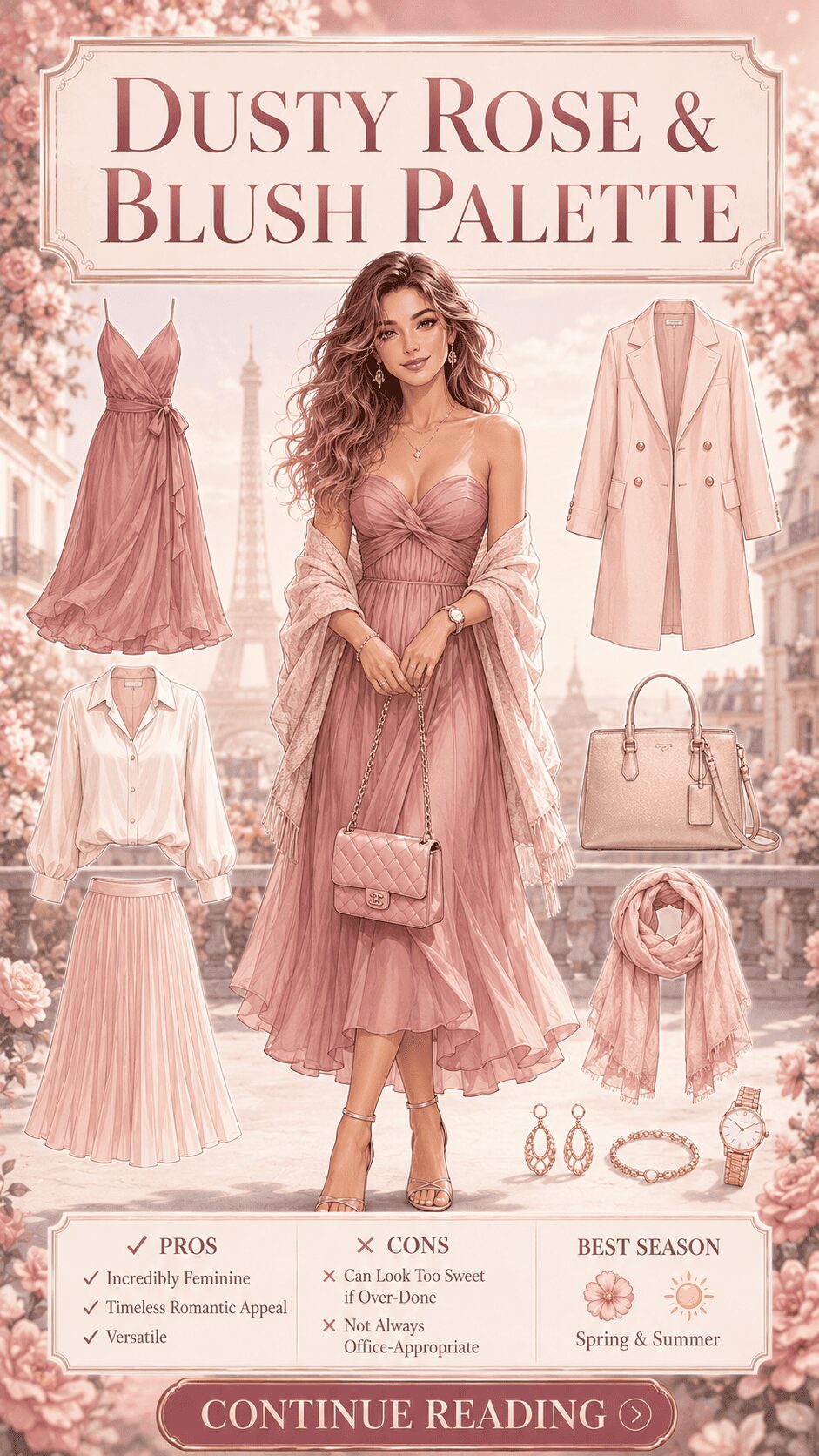
![Dusty Rose Blush Color Palette Women's Clothing]()
Pink-adjacent tones with grey or brown undertones — dusty rose, antique blush, muted mauve, old rose. These are "pink for people who don't wear pink" — softer, more complex, less saccharine than pure candy pink. They carry a hint of nostalgia, a sense of slightly faded romance. In fashion, this palette registers as romantic but sophisticated — it's the pink of high-end intimate wear, bridal separates, and autumn editorial shoots. It tends to work beautifully as a monochromatic approach because the subtle hue variation between dusty rose and antique blush reads as curated rather than matched.


Color temperature affects more than your look — it affects how you're perceived in the room. Cool colors tend to create perceived distance (calm, authoritative, composed). Warm colors tend to close perceived distance (approachable, energetic, engaged). This isn't universal, and it's not deterministic. But it's real enough to be worth thinking about deliberately when choosing between a cool-slate blouse and a warm-terracotta one for, say, a job interview versus a first date. Different temperatures create different social signals — and knowing that gives you an actual choice.
- 23
Cobalt + Navy Palette
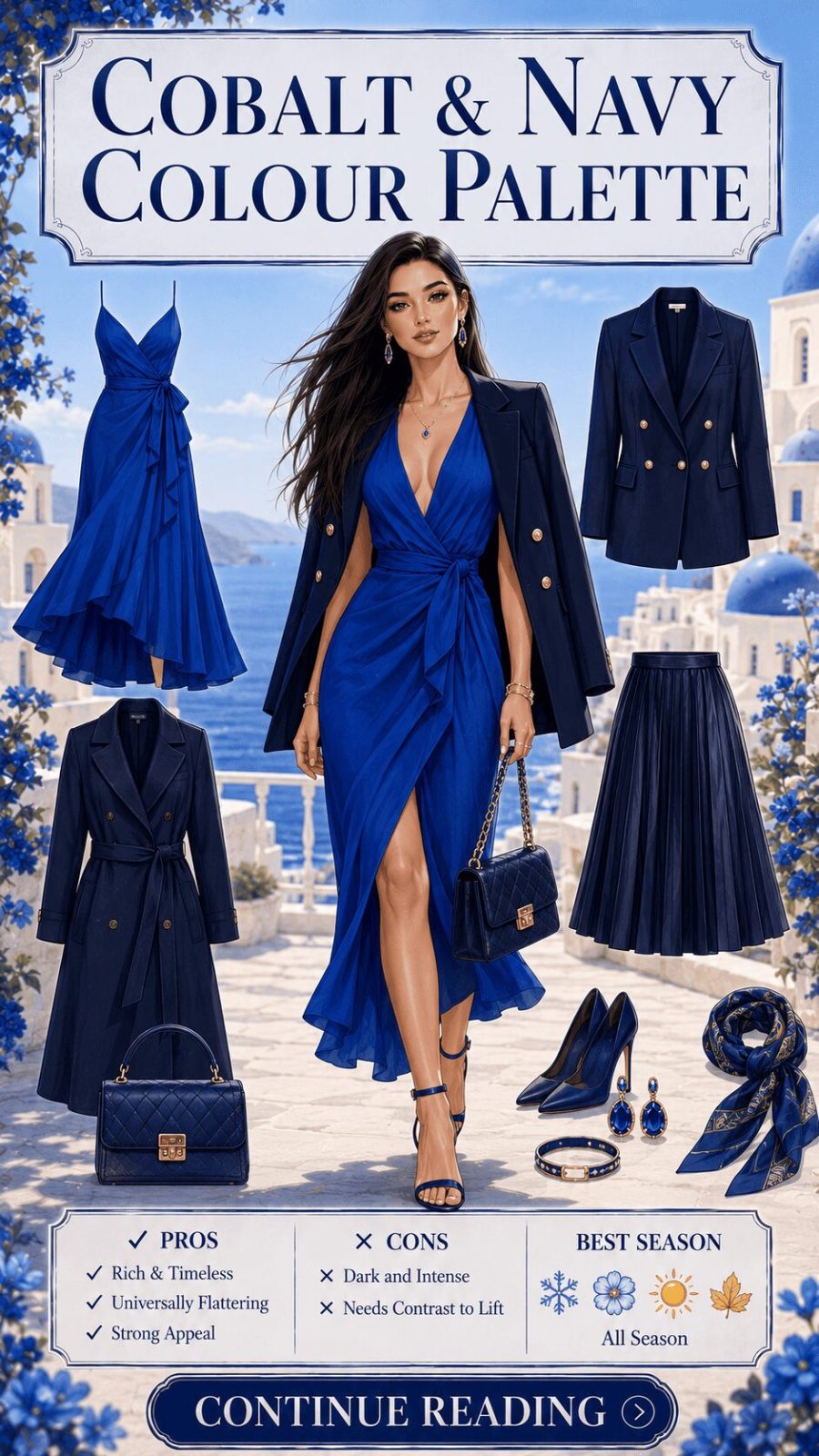
![Cobalt Navy Color Palette Women's Clothing]()
Vivid cobalt blue paired with deep navy — a monochromatic cool-blue palette using contrast of saturation rather than hue change. This is technically a "shade and tone" combination: cobalt is the saturated version, navy is the darkened shade version, of the same hue family. In wardrobing, it reads as nautically influenced but elevated — polish without pretension. The palette is consistently one of the most wearable blue combinations for professional contexts precisely because it avoids the formality of all-navy without introducing an unrelated color.
- 24
Forest Green + Olive Palette
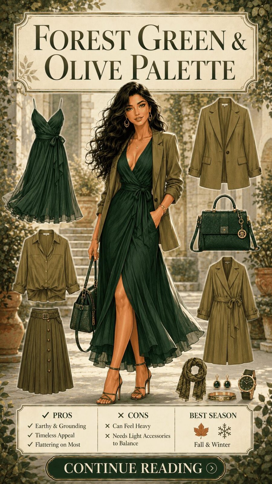
![Forest Green Olive Color Palette Women's Clothing]()
Deep forest green with muted, warm-inflected olive — two green tones sitting at different saturation and warmth levels. Forest green is cool-adjacent, saturated, and lush. Olive is warm-inflected, desaturated, almost yellow-green. Together they create a richly complex green palette that doesn't read as overtly nature-referencing but has a grounded, intellectual quality. This is a palette that works particularly beautifully in outerwear contexts — see our breakdown of jacket styles and how color choices affect their seasonal register.


Category 3: By Mood / Aesthetic (#43–#64)
How a palette feels — the emotional and cultural register color communicates beyond pure chromatic description
This is where the theory meets actual wardrobing decisions. Color temperature and tonal relationships describe the mechanics of a palette. Mood describes what those mechanics communicate — the cultural codes, historical associations, and emotional resonances that have accumulated around particular color combinations through fashion history, art movements, film, and collective cultural memory. These associations are not universal (they vary by culture, generation, and context), but within a shared fashion culture they're remarkably consistent and worth understanding deliberately.
- 43
Romantic Palette
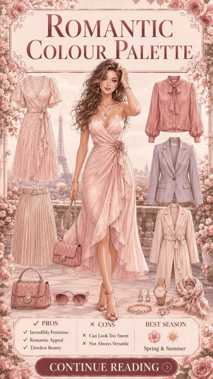
![Romantic Color Palette Women's Clothing]()
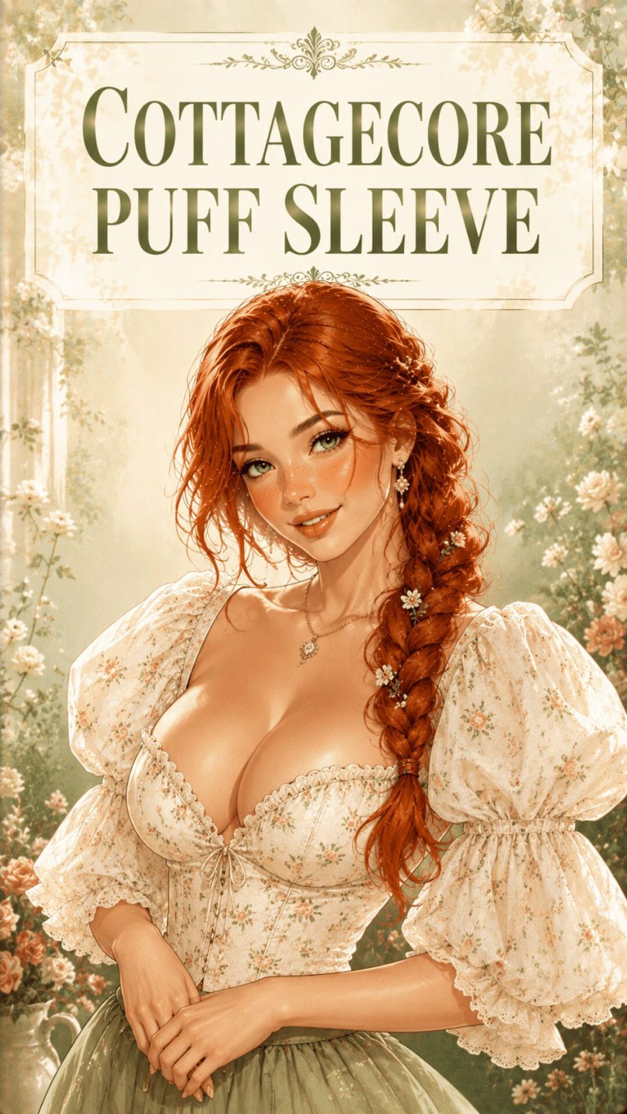
Soft blush, antique rose, pale lavender, warm ivory, gentle sage — colors that evoke tenderness, femininity, and intimacy. The chromatic structure is typically low contrast (close-in values), low saturation, and warm-biased. What makes a palette "romantic" isn't any single color but the combination of softness, warmth, and a certain delicacy of tone. In wardrobing, this palette appears most strongly in occasion dressing — particularly feminine formal wear, bridal separates, and the cottagecore-adjacent aesthetic that dominated fashion Pinterest from 2020 onward.
- 44
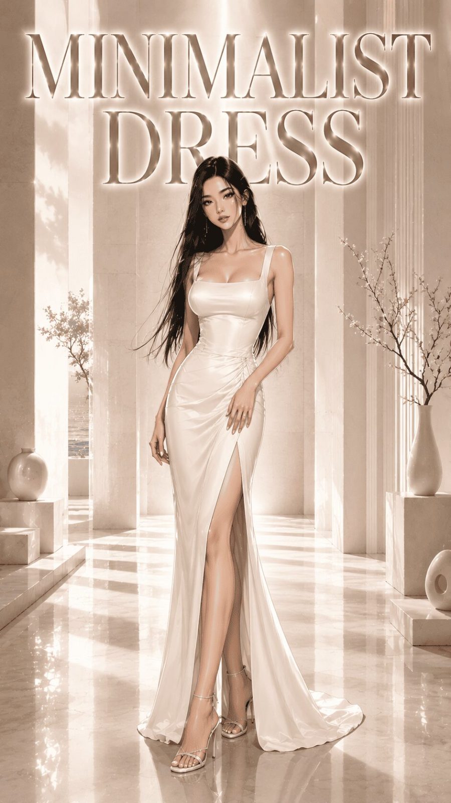
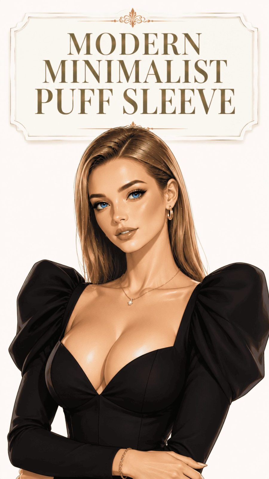
Minimalist Palette
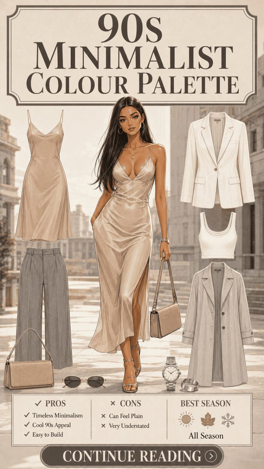
![Minimalist Color Palette Women's Clothing]()
Extreme color restraint — typically black, white, grey, and at most one other hue used at very low saturation. The minimalist palette is less about the specific colors chosen and more about the relationship of reduction: what has been deliberately removed. In fashion terms, this is the palette of the Comme des Garçons tradition, the Jil Sander school, the Celine aesthetic — garments where construction, fabric, and proportion carry all the visual weight because color refuses to compete. Explore our guide on building a minimalist outfit wardrobe for how palette reduction functions in practice.
- 45
Edgy / Dark Aesthetic Palette
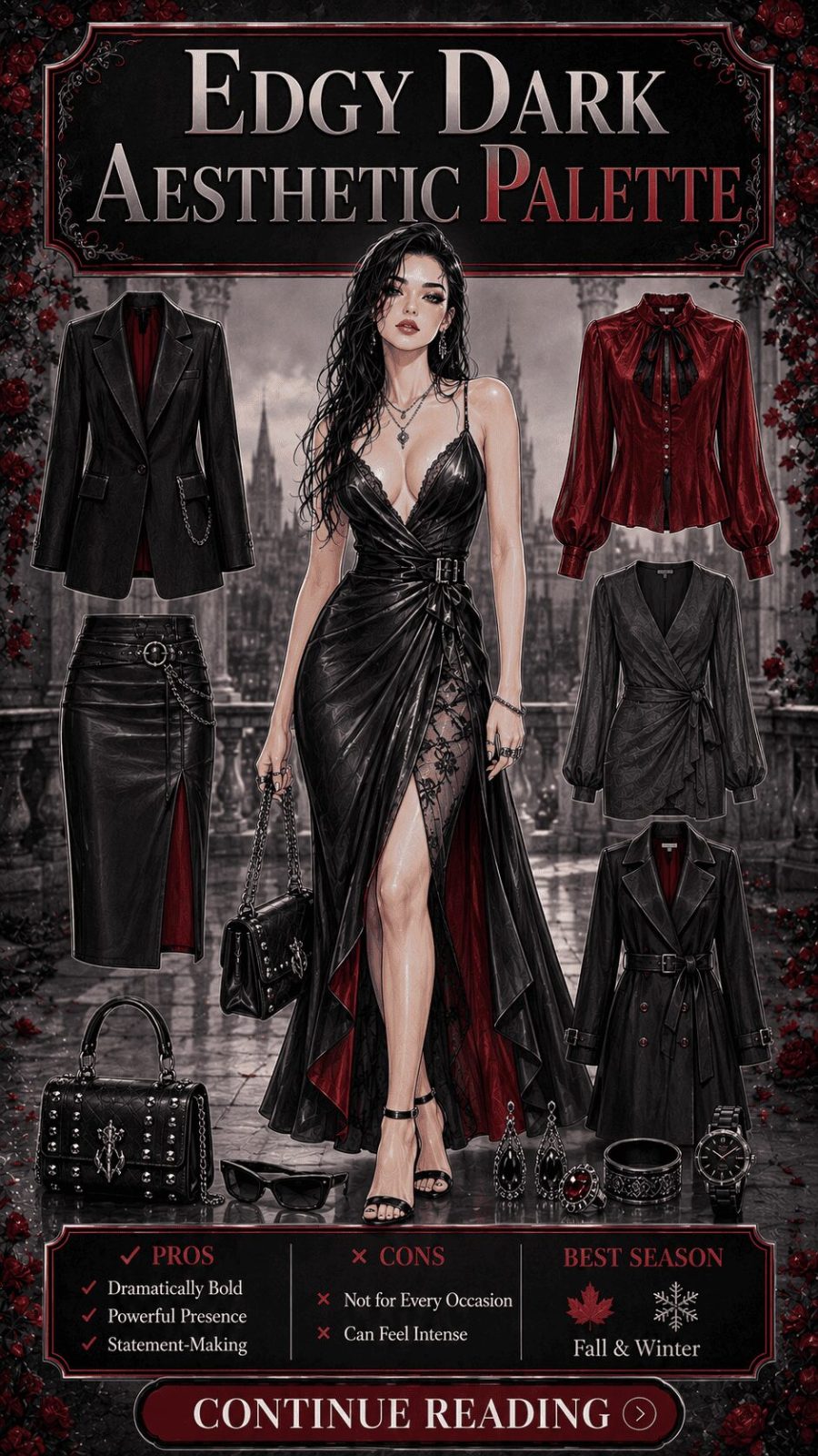
![Edgy Dark Aesthetic Color Palette Women's Clothing]()
Black-dominant with selective accents of deep red, oxblood, dark purple, or metallic silver — the chromatic vocabulary of punk, goth-influenced fashion, and alternative subculture dressing. The palette communicates nonconformity and visual authority simultaneously. What separates an edgy dark palette from simply "wearing a lot of black" is the controlled use of accent: one deep-red boot against all-black, silver hardware against matte black, a deep plum scarf in an otherwise stark charcoal palette. Accent placement is where the personality lives.
- 46
Boho / Earthy Eclectic Palette
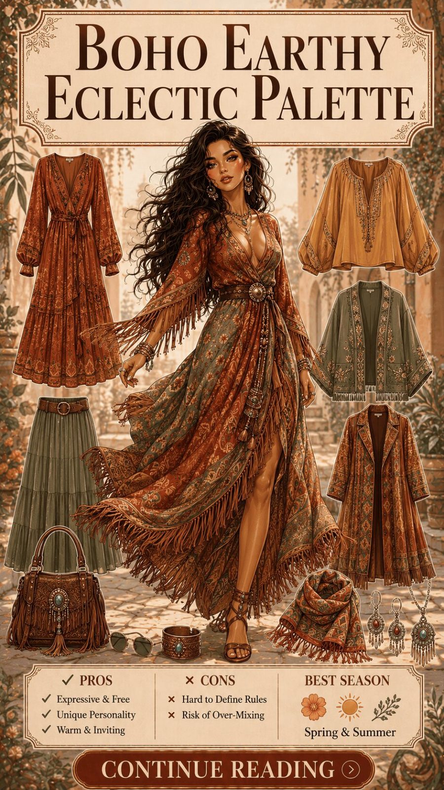
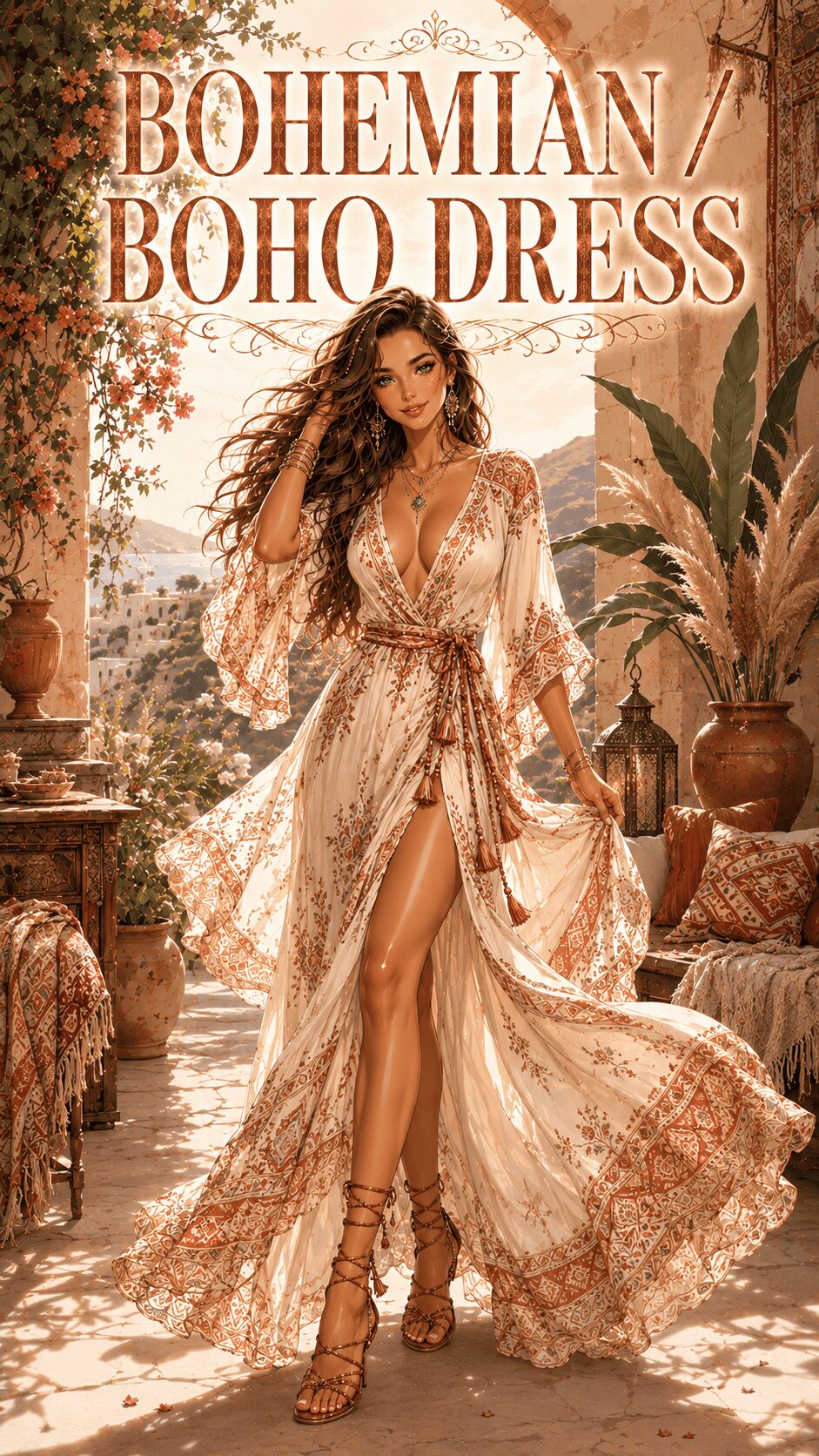
![Boho Earthy Eclectic Color Palette Women's Clothing]()
Warm earth tones combined with unexpected rich accent colors — terracotta with turquoise, golden ochre with deep teal, burnt sienna with violet. The boho palette borrows from global textile traditions: Moroccan tile colors, Southwestern American weaving palettes, Indian block-print dye traditions. What makes it "boho" rather than simply eclectic is the warmth of the base colors and a certain relaxed layering of pattern and texture that lets multiple palette references coexist. Related kaftans and flowing forms benefit particularly from this palette — our kaftan style breakdown covers the fabric and silhouette side of this aesthetic.


- 47
Preppy / Classic Palette
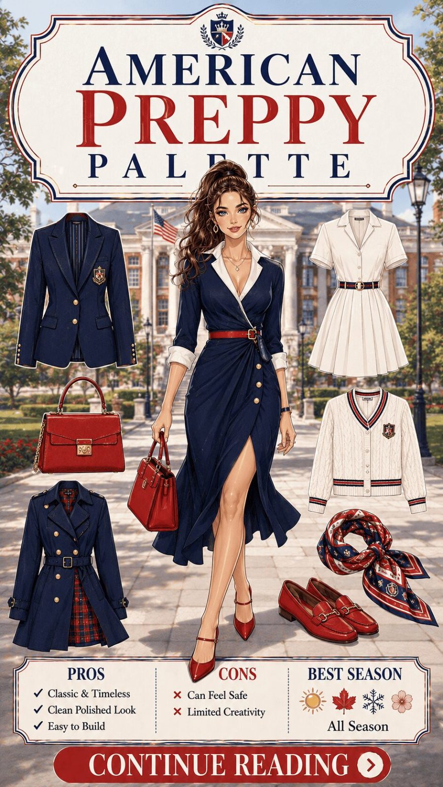
![Preppy Classic Color Palette Women's Clothing]()
Navy, white, red, and Kelly green — the chromatic vocabulary of New England collegiate dressing, British country fashion, and the Ralph Lauren tradition. These colors have maintained remarkable cultural consistency in Western fashion since the mid-20th century, which makes the preppy palette one of the most reliable "heritage" references in contemporary wardrobing. What's interesting is that it works precisely because of its legibility — everyone understands the reference immediately — which is why it remains particularly effective in professional contexts where perceived establishment credentials carry social weight.
- 48
Maximalist / Clashing Palette
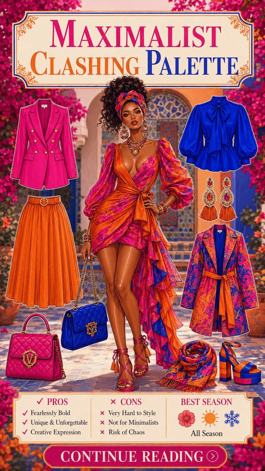
![Maximalist Clashing Color Palette Women's Clothing]()
Intentional color conflict as a design statement — pairing hues that conventional wisdom would call "clashing": fuchsia with orange, lime with cobalt, red with pink. Here's the honest truth: clashing palettes are actually one of the most technically demanding approaches to execute. When they work, they look electric and joyful and genuinely original. When they don't, they look like a wardrobe error. The difference is usually intentionality — does this person look like they chose this, or discovered it by accident? Styling context, proportion, and the presence of a clear focal point all contribute to making deliberate clashing readable as a statement.
- 49
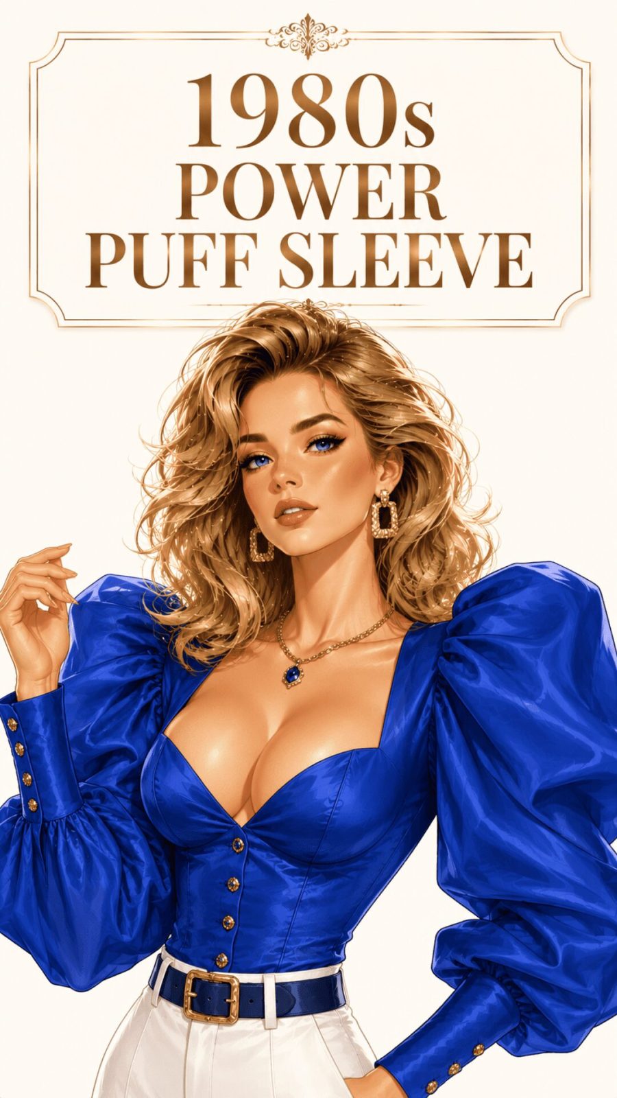
Corporate / Power Palette
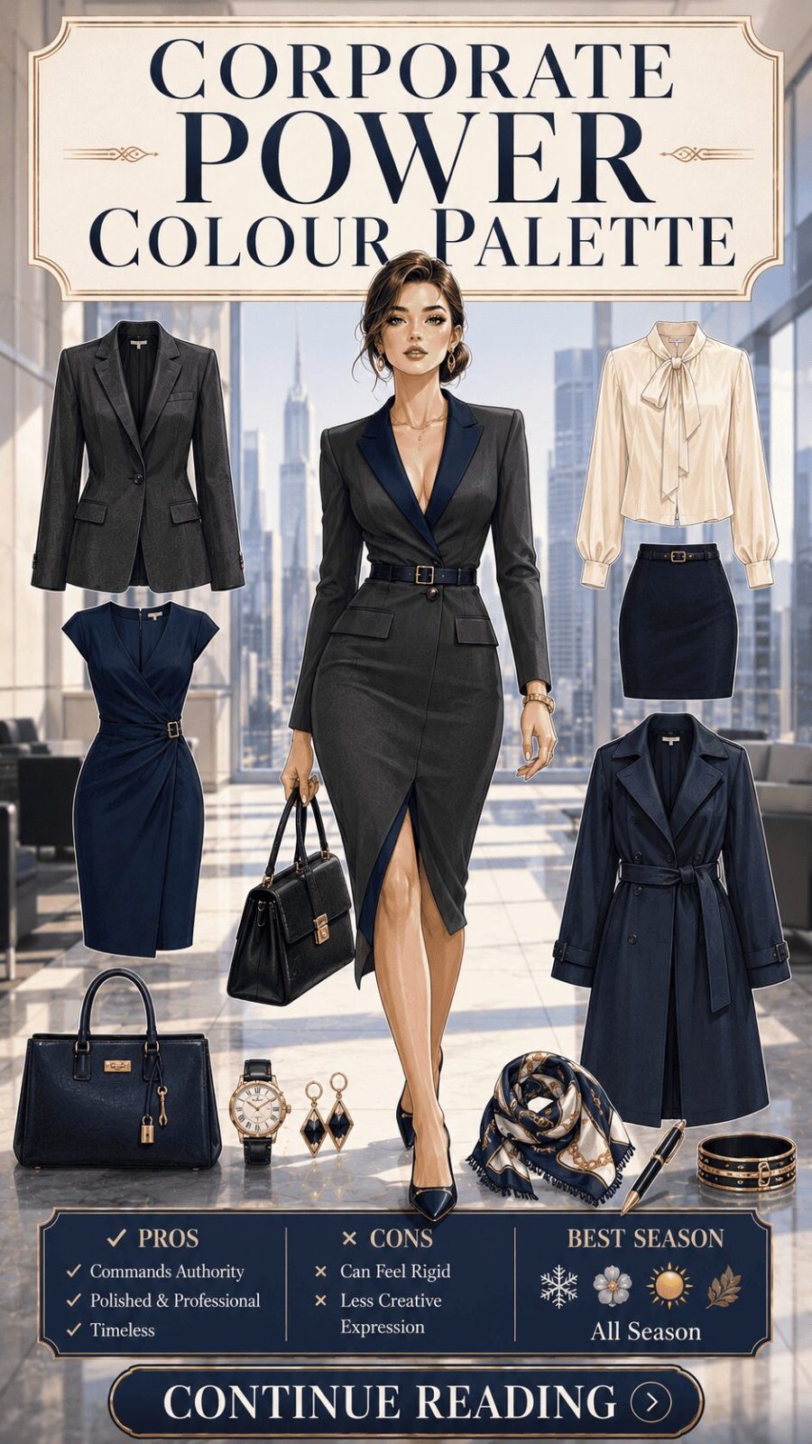
![Corporate Power Color Palette Women's Clothing]()
Navy, charcoal, deep teal, burgundy, and the kind of cool cream that looks like deliberate restraint. The corporate palette communicates credibility, authority, and focused intelligence. The palette itself is borrowed from menswear suiting traditions and has been translated into women's professional dressing since the 1980s power-dressing era — with contemporary approaches softening the formula through jewel tone additions (sapphire, forest green, rich burgundy) while retaining the fundamental high-value, low-whimsy approach. For the full picture of how these colors translate across formal clothing types, our guide on women's formal wear and occasion dressing covers the garment side.
- 50
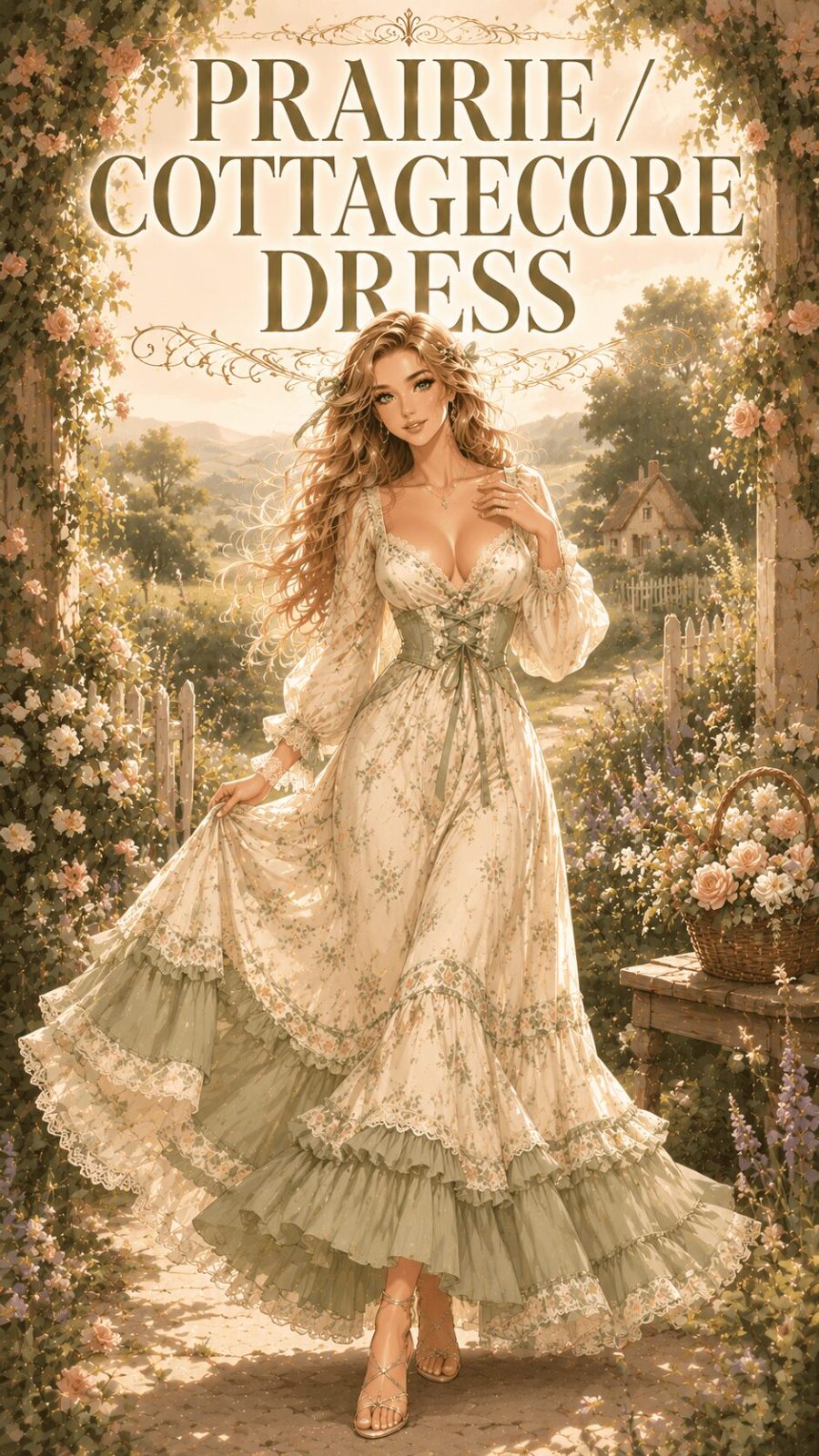
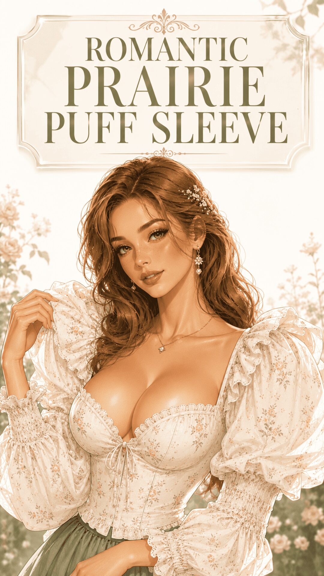
Soft Cottagecore Palette
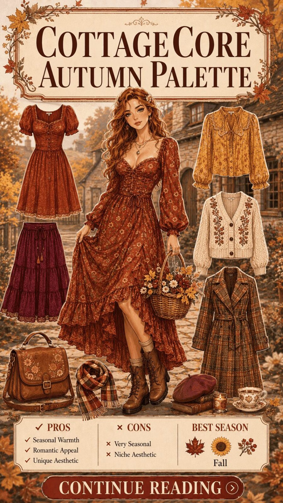
![Soft Cottagecore Color Palette Women's Clothing]()
Warm white, butter yellow, sage green, rose blush, and soft lavender — the palette of English country gardens, wildflower meadows, and the pastoral idealization that the cottagecore aesthetic made a mainstream fashion movement between 2020 and 2024. This palette's remarkable longevity (well beyond the social-media trend cycle that launched it) is partly structural — these are genuinely harmonious, naturally soft colors that work across skin tones — and partly cultural, tapping into a consistent nostalgic yearning for slower, simpler living that predates the TikTok era entirely. Explore cottagecore outfit styles and how palette shapes the whole look.


Mood palettes carry cultural codes that work whether or not you consciously recognize them. A corporate palette sends signals before you say a word. A maximalist clashing palette makes a social claim about fearlessness and self-determination. The question worth asking isn't "does this color suit me?" — it's "does this palette communicate something true about how I want to show up in this context?" That's a more interesting question, and it leads to significantly more considered wardrobe decisions.
- Every mood palette carries cultural codes — the question isn't just "does it suit me" but "does it communicate what I want to communicate in this context"
- Maximalist clashing is technically demanding — the difference between intention and accident is legibility to the viewer
- The cottagecore palette outlasted its trend moment precisely because the underlying chromatic logic — soft, warm, low-contrast — is genuinely harmonious and broadly flattering
- Minimalist palettes work because reduction forces quality — when color doesn't do the work, fabric and fit must
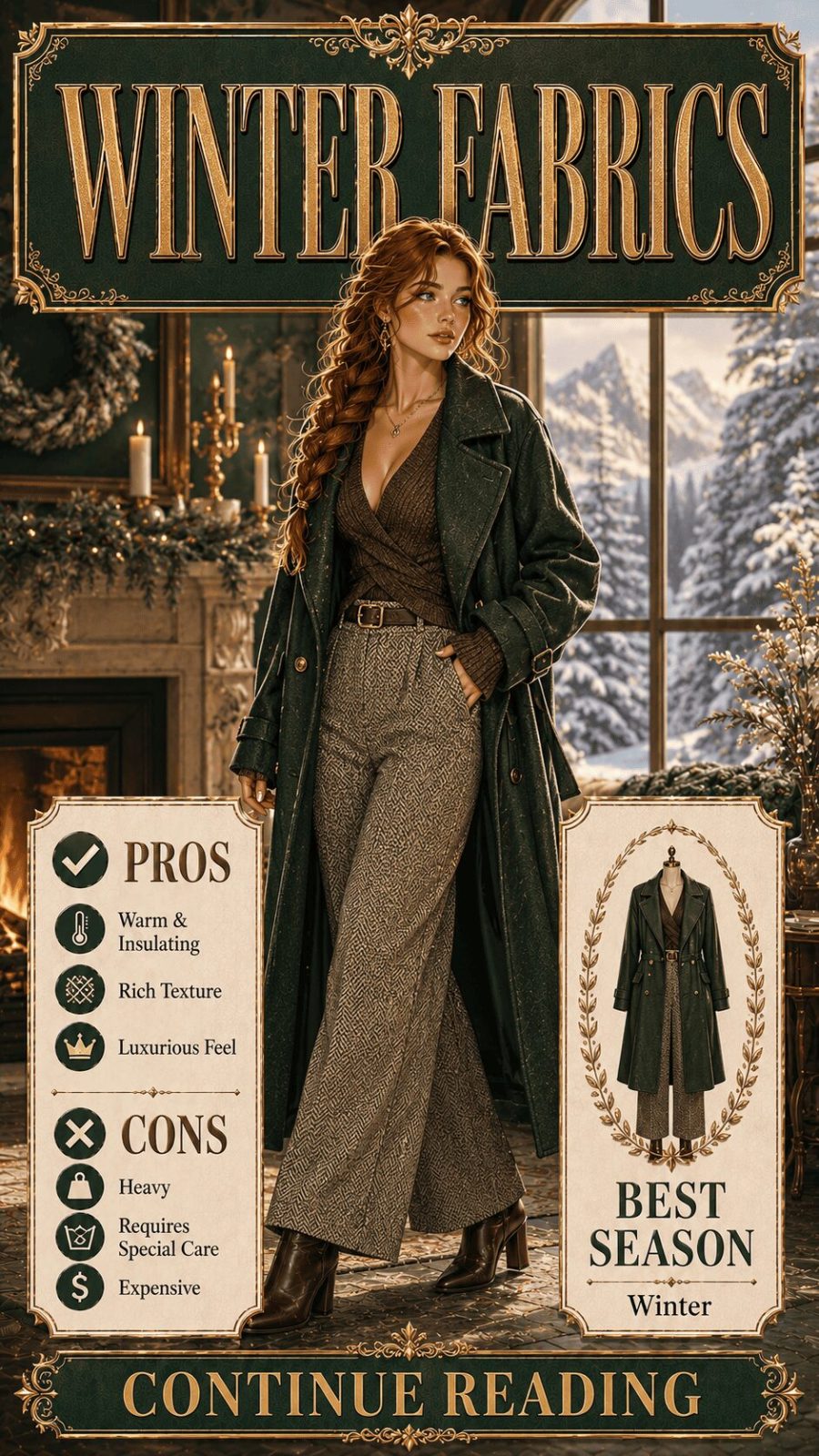
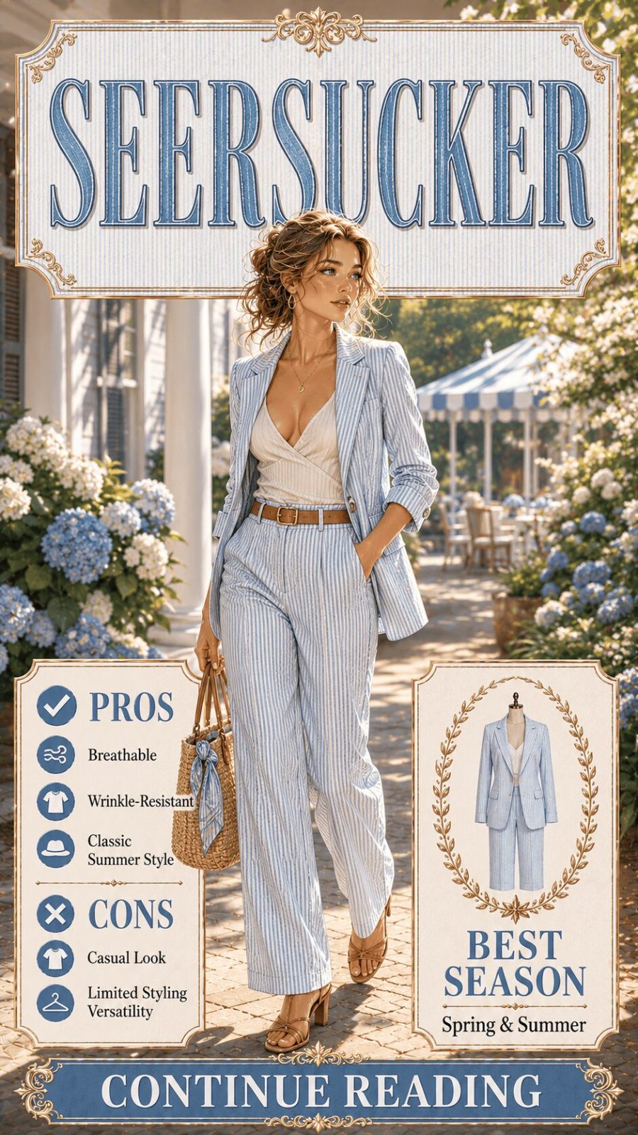
Category 4: By Seasonal Color System (#65–#80)
The personal color analysis framework — how individual undertone types interact with palette categories
The seasonal color analysis system — popularized through Carole Jackson's Color Me Beautiful (1980) and substantially expanded through the 12-season Sci/ART method developed by Kathryn Kalisz — maps personal undertone types to palette families. The core premise: colors interact with skin undertone in ways that can make complexion appear more luminous or more sallow depending on alignment. The four traditional seasons (Spring, Summer, Autumn, Winter) were later refined into 12 sub-seasons to account for the genuine complexity of undertone variation. This is not prescriptive — it's analytical. And the system works best as a starting vocabulary for exploration, not a fixed rule.
- 65
True / Bright Spring Palette
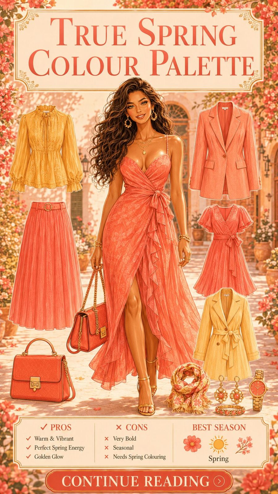
![True Spring Color Palette Women's Clothing]()
Clear, warm, and bright colors — peach, coral, warm turquoise, golden yellow, ivory, apple green, camel. The True Spring palette is built around warmth and clarity: no grey muddying, no black heaviness. Within the seasonal system, this maps to complexions with golden or peachy undertones and medium-to-high natural contrast. The palette's characteristic quality is freshness — these colors feel genuinely energetic rather than forceful, vibrant rather than aggressive. In wardrobing, True Spring palettes translate beautifully into spring and resort dressing where brightness and warmth align with the ambient seasonal light.
- 66
True / Soft Summer Palette
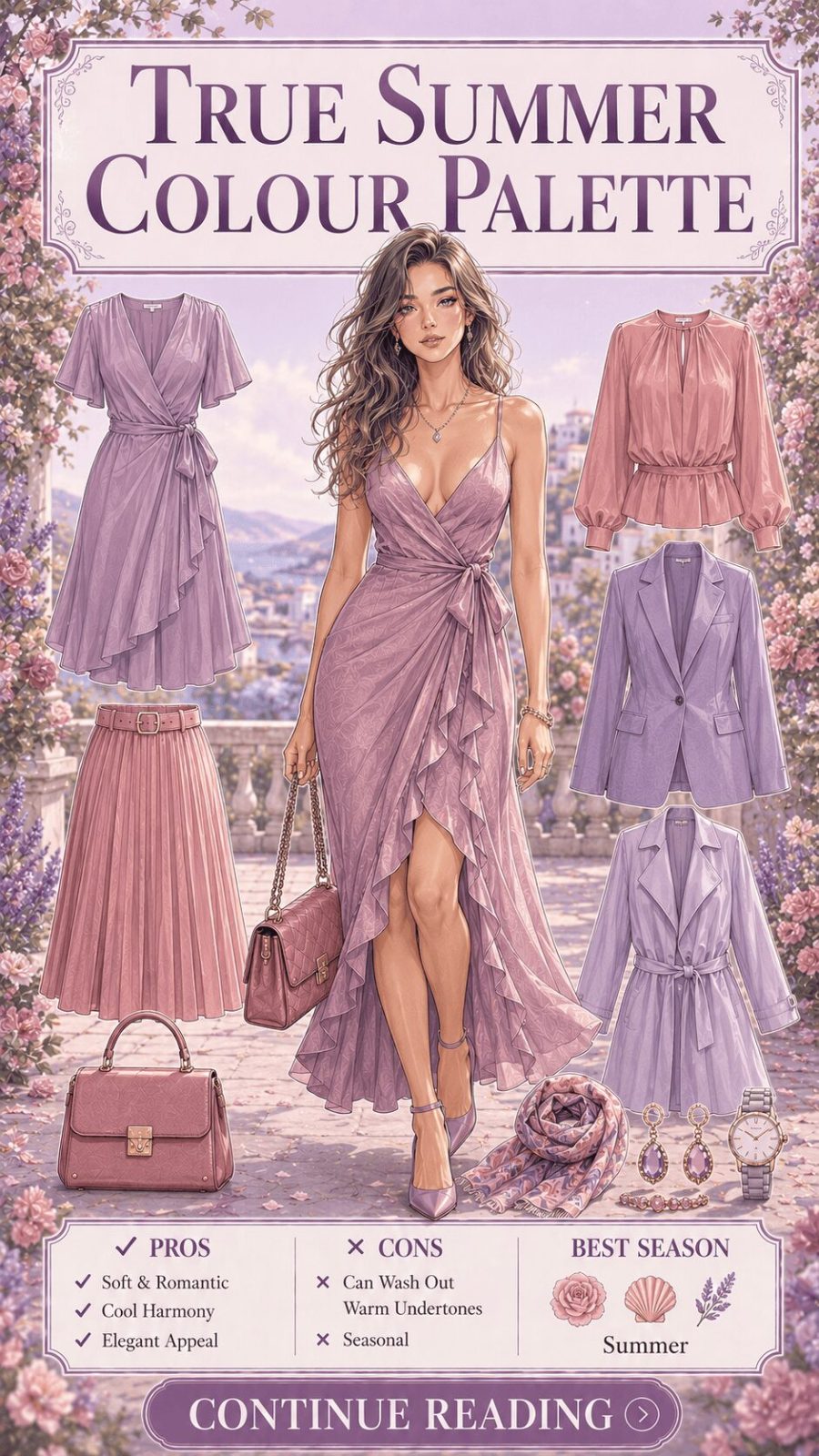
![True Summer Color Palette Women's Clothing]()
Cool, soft, and muted — powder blue, rose pink, soft lavender, dusty mauve, cool taupe, muted teal. The True Summer palette is built around cool undertones and low-to-medium saturation. No warmth, no yellow. In the seasonal system, this maps to complexions with pink, blue, or ash undertones. Practically: the palette has a gentle, watercolor quality — it photographs with a softness that looks intentionally artistic rather than washed out. The key wardrobe insight is that brilliant white and harsh black don't belong here; ivory and charcoal substitute with much more flattering effect.
- 67
True / Warm Autumn Palette
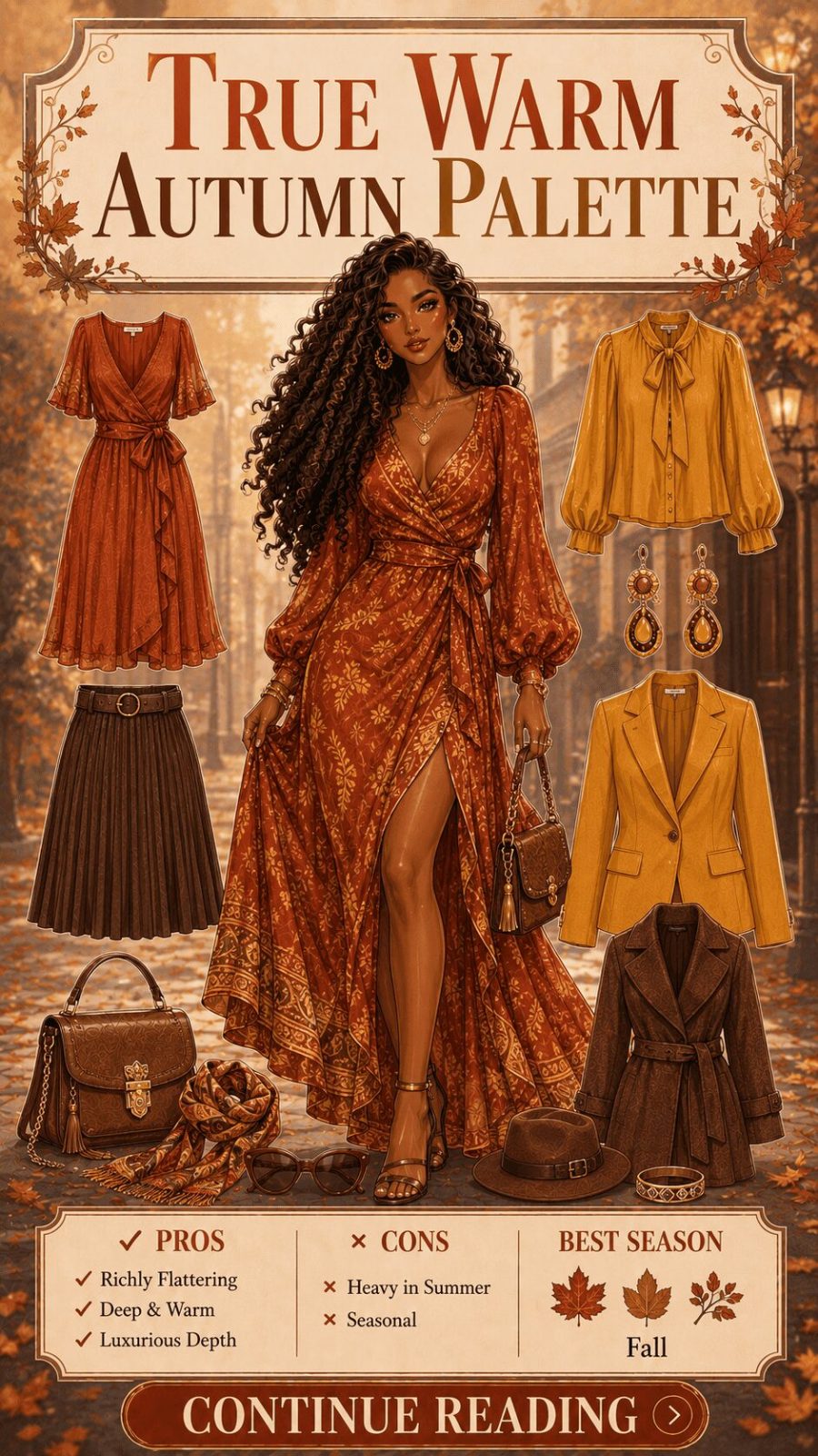
![True Autumn Color Palette Women's Clothing]()
Rich, warm, and deeply saturated — rust, burnt orange, tomato red, mustard, olive green, warm brown, caramel. No cool tones, no blue-based pinks. The True Autumn palette is built around the harvest season's color story: nature's warmest, most generous hues at their most saturated. In the seasonal system, this maps to complexions with strong golden or copper undertones and rich natural coloring. These are colors that look genuinely spectacular in autumn light — which isn't coincidence; the palette was literally named for the season it resonates with most powerfully.
- 68
True / Clear Winter Palette
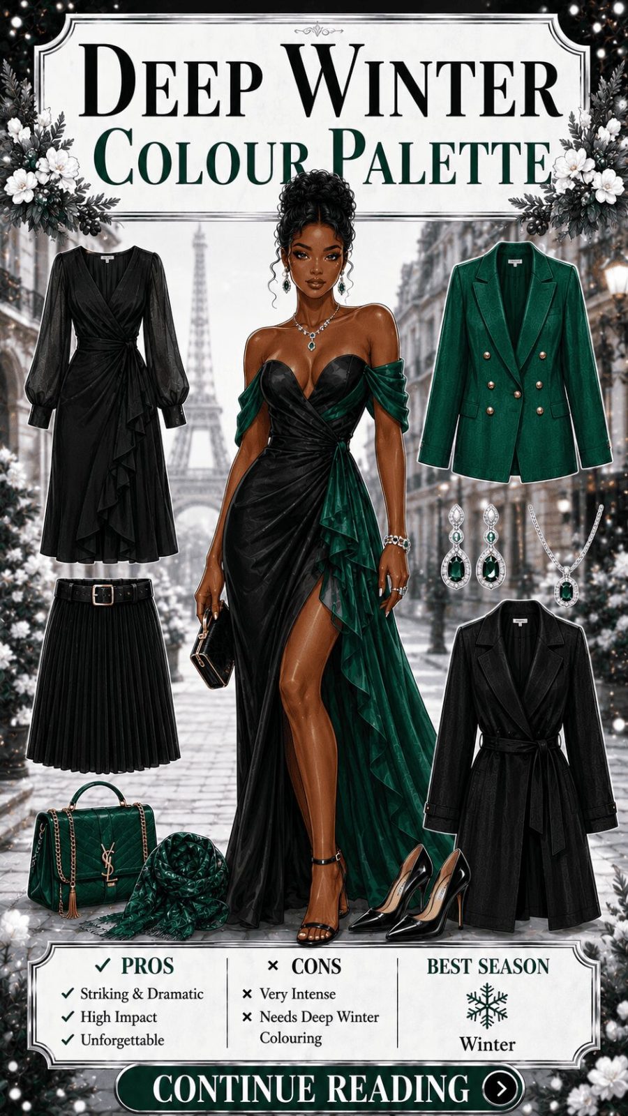
![True Winter Color Palette Women's Clothing]()
Cool, clear, and high contrast — icy white, true black, royal blue, ruby red, bright fuchsia, emerald, bright violet. The True Winter palette is defined by clarity and cool temperature — no warmth, no muddiness, no transition tones. In the seasonal system, this maps to complexions with high natural contrast and cool (blue or neutral) undertones. These are the clearest colors in the entire system — undiluted by grey or gold. In wardrobing, True Winter palettes make a strong statement precisely because of this purity. The palette doesn't compromise, and neither should its application.


Category 5: By Occasion / Dress Code (#81–#100)
Color palettes mapped to specific social contexts — what reads appropriately, powerfully, or joyfully where
Occasion dressing is where color theory becomes practical strategy. A palette that photographs beautifully in afternoon light may read as oddly muted in office fluorescents. A jewel-tone combination that feels perfect for a formal dinner becomes excessive at a casual brunch. Color — like clothing construction itself — functions differently across contexts, and understanding those contextual shifts is one of the most genuinely useful things you can internalize about how to dress. These palettes aren't prescriptions. They're maps of what tends to work, built from observable pattern rather than arbitrary rules.
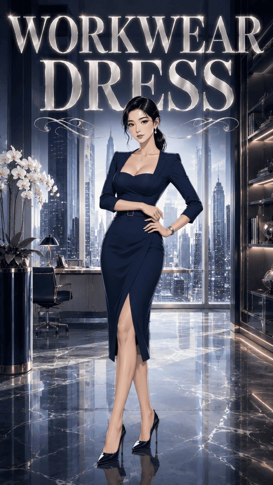
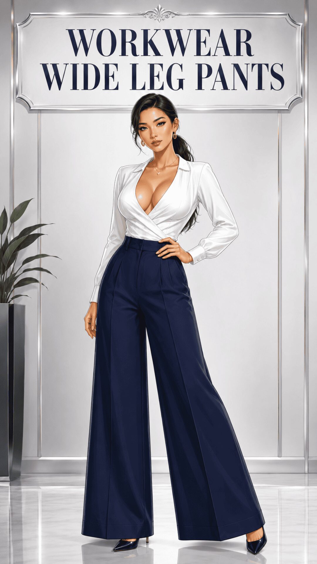
- 81
Workwear Palette
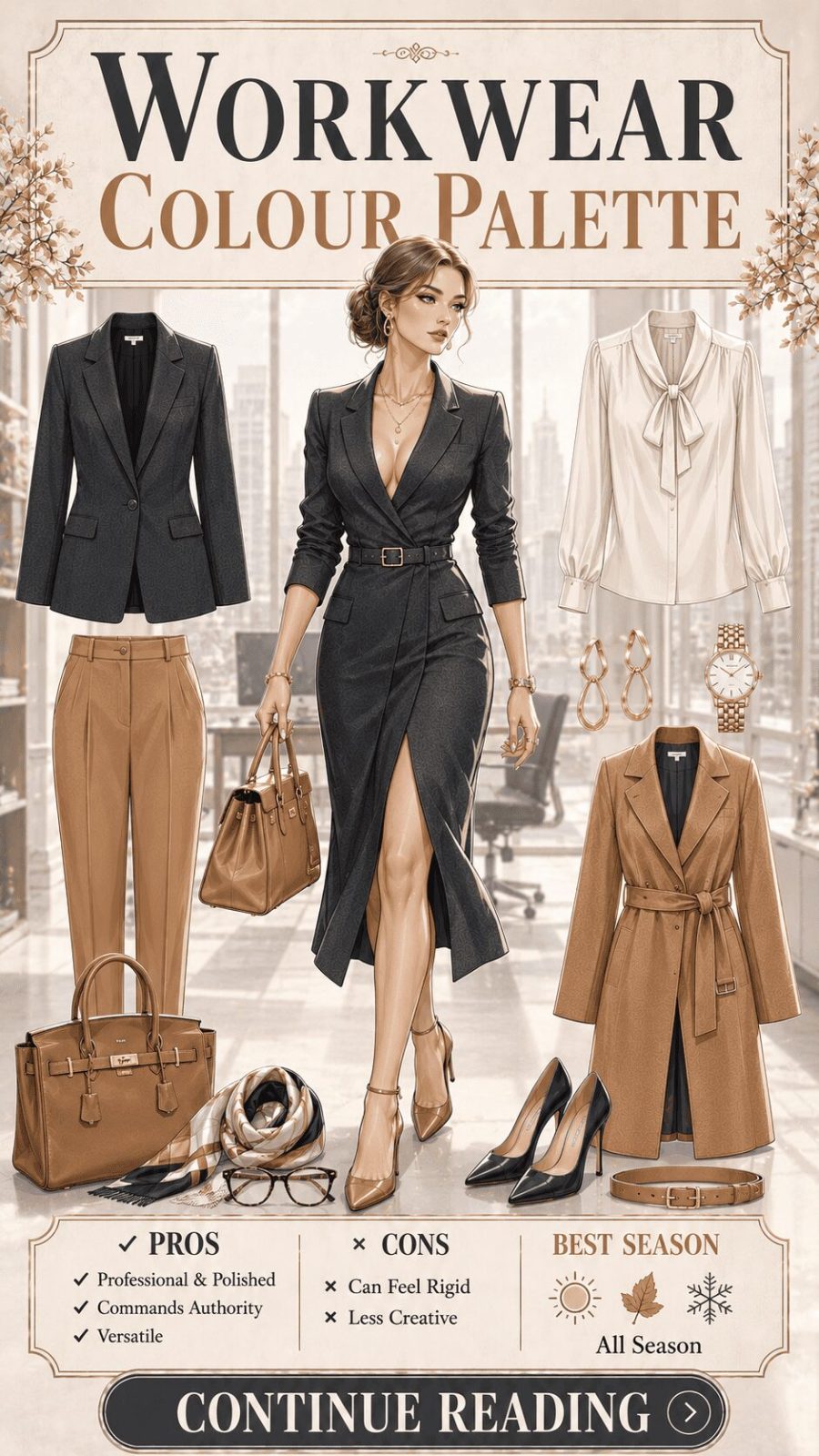
![Workwear Color Palette Women's Clothing]()
Navy, charcoal grey, warm cream, burgundy, and slate blue — the dependable architecture of professional dressing. The workwear palette is structurally conservative by design: its purpose is to project credibility and focused competence without visual distraction. This doesn't mean boring — a deep cobalt blazer paired with soft cream trousers is technically a workwear palette. What defines it is the absence of trend-chasing colors and the presence of hues that photograph well under artificial office lighting, which tends to wash out pastels and oversaturate neons. Our full breakdown of office outfit styles and how color choice shifts professional register covers the garment side in detail.
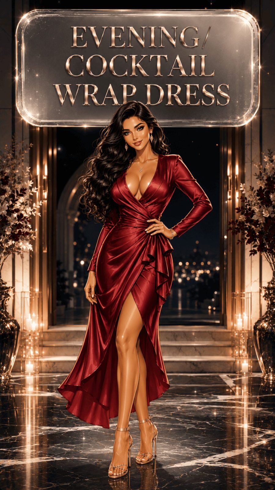
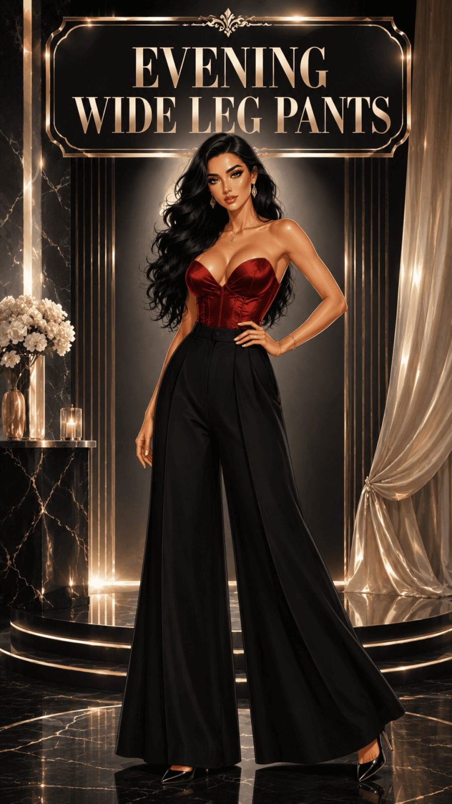
- 82
Evening / Cocktail Palette
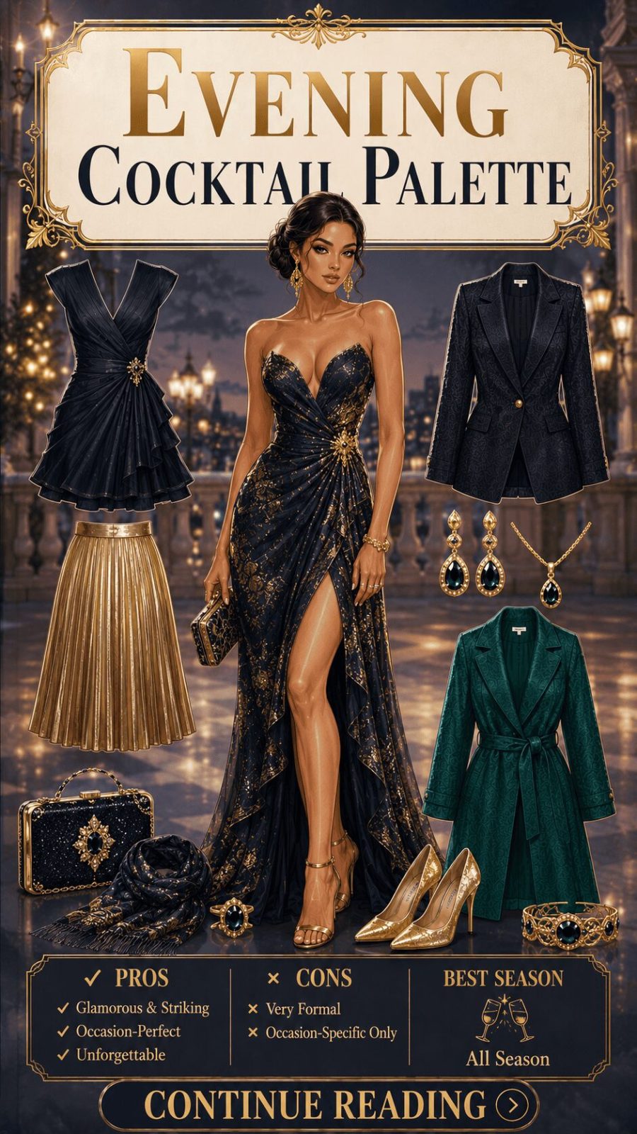
![Evening Cocktail Color Palette Women's Clothing]()
Midnight black, deep burgundy, sapphire blue, metallic gold and silver, champagne, deep emerald. Evening dressing has its own chromatic logic: these are colors designed to perform under artificial light — specifically the warm, directional, often low-key lighting of restaurants, event spaces, and private homes. Black absorbs light and reads as recessive and elegant. Metallics catch and reflect light dramatically. Jewel tones deepen in artificial light rather than washing out as pastels do. The evening palette is architecturally the inverse of the workwear palette — where workwear seeks invisibility of effort, evening dressing allows and rewards deliberate glamour.
- 83
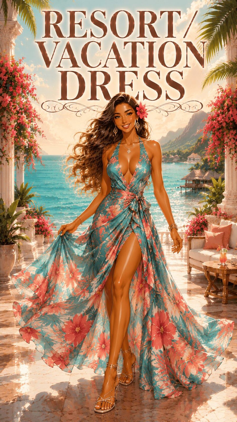
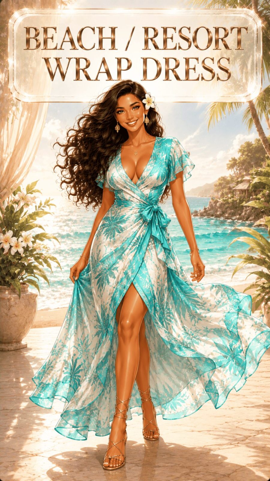
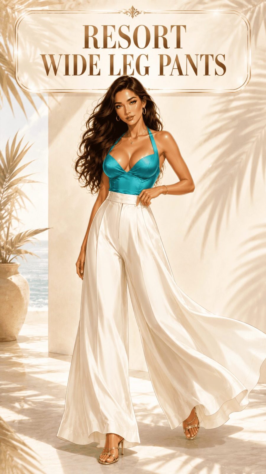
Vacation / Resort Palette
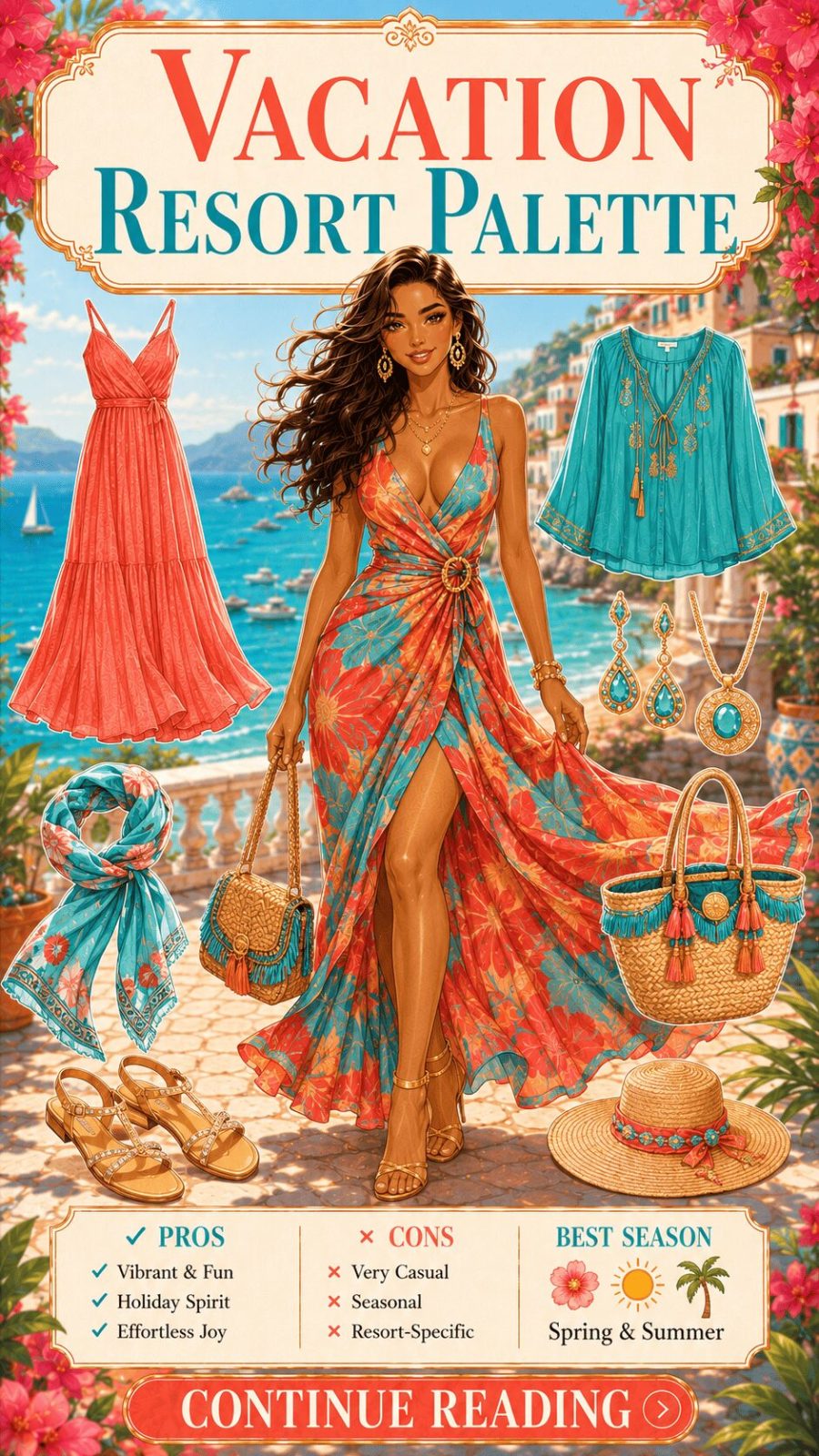
![Vacation Resort Color Palette Women's Clothing]()
Turquoise, coral, warm white, papaya orange, sunshine yellow, sandy beige, ocean blue. The vacation palette is built around warm, sun-saturated colors that perform beautifully in outdoor natural light — particularly the intense, high-angle light of tropical and coastal environments. These are not office colors. They're colors that read as joyful and carefree precisely because they reference heat, sky, and ocean. In fashion calendar terms, resort collections (typically presented between November and January) specifically address this palette register — the clothing designed to be bought in winter and worn somewhere warmer. Related summer dressing styles are covered in our resort wear guide.
- 84
Wedding Guest Palette
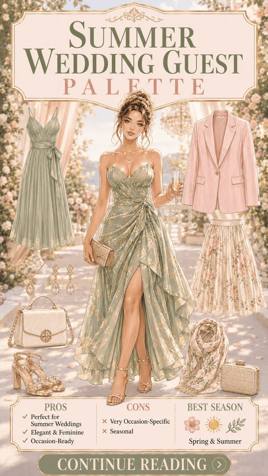
![Wedding Guest Color Palette Women's Clothing]()
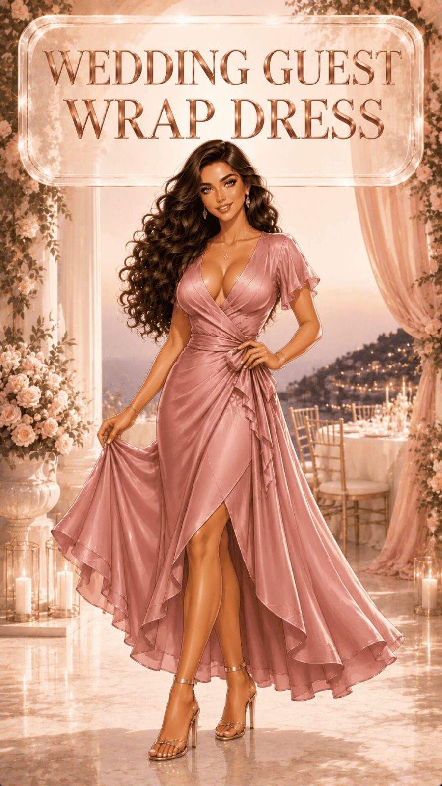
Blush, dusty rose, champagne, soft sage, powder blue, warm lilac, gold — and the perennial avoidance of pure white and near-white ivory. The wedding guest palette is unique in fashion because it's socially governed rather than aesthetically arbitrary: the white-avoidance rule exists to avoid visual competition with the primary dresser, not because white is inherently problematic. Beyond that single constraint, the wedding guest palette is probably the most joyfully varied occasion register in women's dressing — almost every palette in this guide can work depending on the formality, season, and vibe of the specific event. Our wedding guest outfit guide on what to wear and why palette matters digs into this further.


- 85
Festival / Street Palette
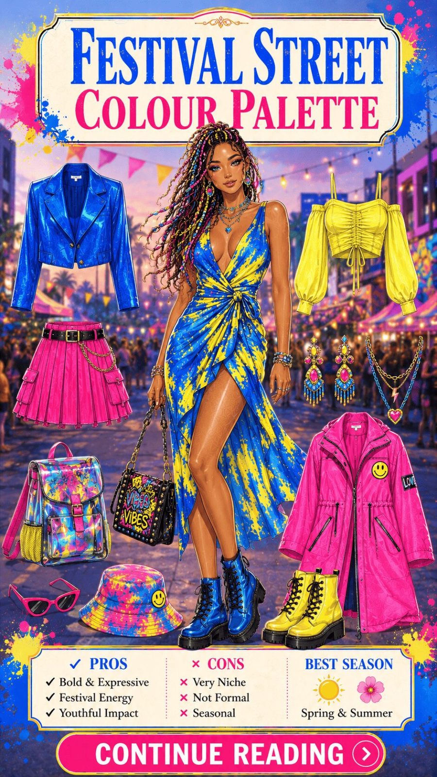
![Festival Street Color Palette Women's Clothing]()
Vivid, mixed, rule-ignoring — neon brights alongside earthy tones, metallics next to tie-dye, pattern-clashing as intentional strategy. The festival palette isn't a single color story; it's a deliberate rejection of the palette restraint that governs other occasion registers. Context permission is part of what makes it work: a festival is one of the few social environments where maximalist color expression is not only acceptable but genuinely encouraged. The streetwear context is slightly more curated — brighter than workwear but more considered than pure festival dressing — typically built around one or two statement colors with a monochromatic or neutral base. For streetwear styling approaches, our streetwear outfit guide covers color strategy within that specific aesthetic framework.
- 86
Athleisure Palette
![Athleisure Color Palette Women's Clothing]()
Monochromatic neutrals (all-grey, all-black, all-beige) alongside tonal pops of one brand-signature color — the visual language that premium activewear brands built their identities around. The athleisure palette is architecturally clean: a dark or neutral base that reads as technical and serious, with color accents that signal energy without compromising the overall polished-casual aesthetic. What separates athleisure color from pure activewear color is restraint — one accent, used deliberately, rather than the full-spectrum color explosion of performance sportswear. Our athleisure outfit styling guide maps this directly to specific pieces.
- 87
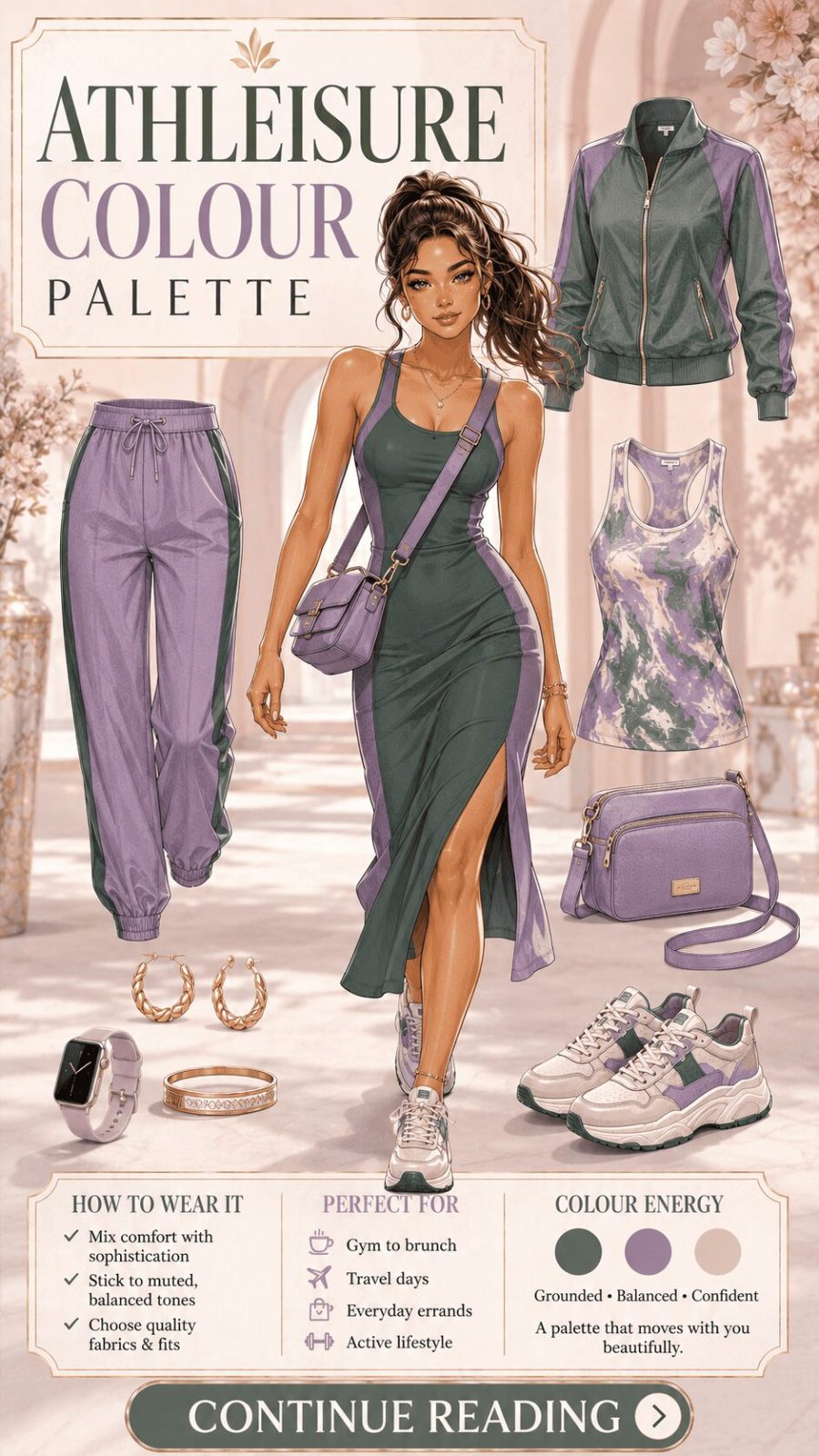
Brunch / Smart-Casual Palette
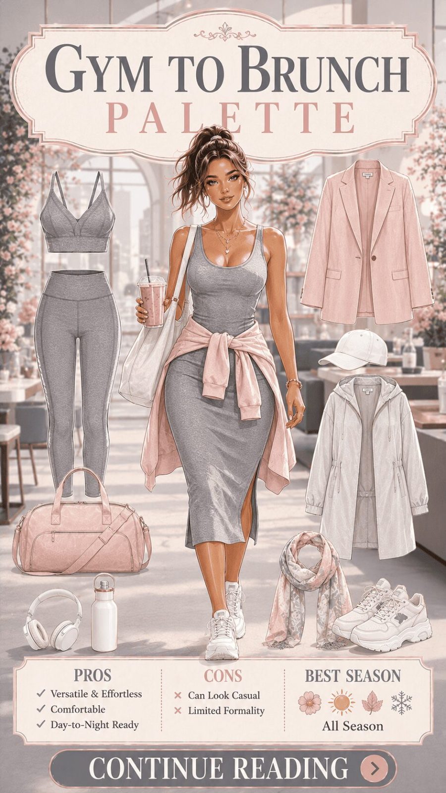
![Brunch Smart Casual Color Palette Women's Clothing]()
Warm neutrals, dusty pastels, warm terracotta, sage green, burnt caramel, soft white — the palette of afternoon light and good coffee. The brunch palette is architecturally a softened version of workwear: relaxed enough to communicate ease, polished enough to communicate effort. What actually defines this register is light saturation and warm undertones — it's the palette of natural daylight, designed for human-facing social environments rather than corporate performance or nightlife spectacle. Practically: brunch colors tend to be colors you'd feel comfortable in without checking a mirror more than once. That ease is the target. Browse our brunch outfit guide for the garment applications.
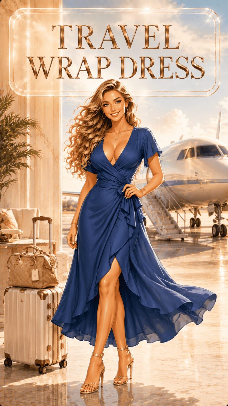
- 88
Travel / Airport Palette
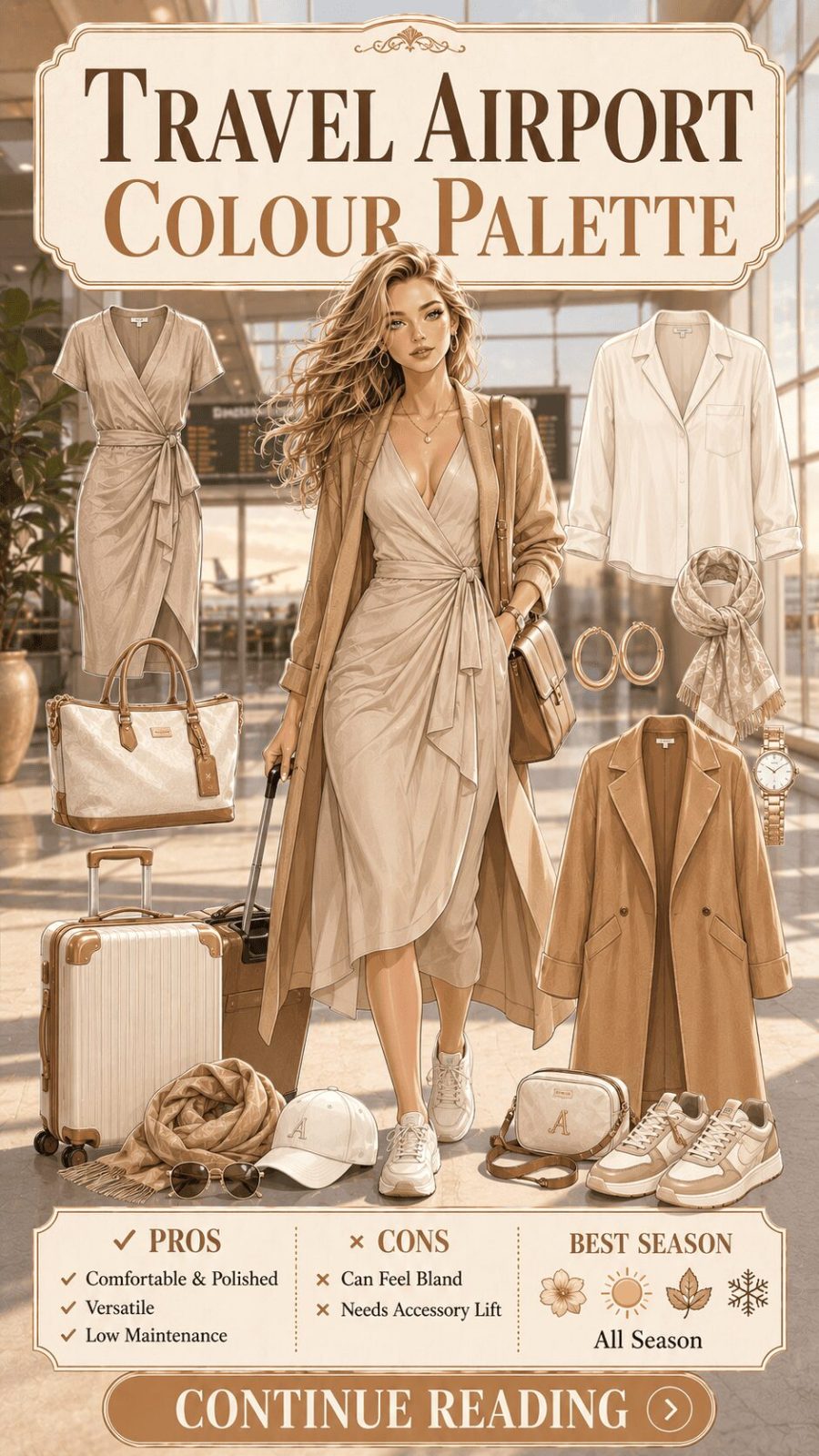
![Travel Airport Color Palette Women's Clothing]()
Navy, black, stone grey, warm tan, and camel — the palette of practical elegance. Travel dressing has its own chromatic logic: colors that don't show wear, don't crease visibly in darker tones, don't look stale after multiple wears through varied lighting environments. The travel palette is perhaps the most functionally motivated category in this guide — it exists not for photographic performance or social signalling but for sustained wearability across long, unpredictable, high-wear days. Darker neutrals dominate because they read as intentional regardless of minor dishevelment. For the silhouette side of travel dressing, our airport outfit breakdown covers what works structurally and why.


Here's something most people don't consider: the lighting of the occasion is part of the palette decision. Evening events under warm incandescent or candlelight make jewel tones richer and pastels disappear. Outdoor daylight makes brights sing and dark colors absorb rather than reflect. Fluorescent office lighting flattens muted tones and can make pastels look ill-lit. Before choosing a palette for a specific occasion, think about the lighting you'll actually be standing in — not just the dress code. That single consideration alone transforms how intentional your color choices feel.
Category 6: By Cultural / Regional Origin (#101–#118)
Palette traditions rooted in geography, textile craft history, and cultural visual language
Every major textile culture developed its characteristic palette through the specific plant dyes, mineral pigments, and natural materials available to it — and those color traditions became cultural identity markers that persist long after synthetic dye technology made every color accessible everywhere. Indian block-print textiles carry particular color signatures. Scandinavian folk dress has its own palette logic. West African kente weaving, Peruvian highland textiles, Japanese shibori dyeing traditions — all carry palette identities that reference place and craft simultaneously. Modern fashion borrows from all of these traditions, sometimes thoughtfully and sometimes not. Understanding the palette origins helps distinguish genuine reference from aesthetic plunder.
- 101
Scandinavian Palette
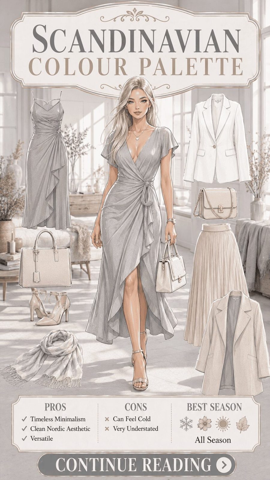
![Scandinavian Color Palette Women's Clothing]()
Crisp white, pale grey, birch beige, dusty blue, forest pine, and the occasional accent of deep red or ochre. The Scandinavian palette reflects the particular light quality of Nordic climates — long winters where diffuse grey-white light dominates, and summers of extraordinary clarity. The aesthetic privilege of the region's design tradition (applied to fashion through brands like Acne Studios, Arket, and COS) is an ability to make restraint feel genuinely sophisticated rather than merely underdressed. The palette avoids warm tones almost entirely in its cleanest expressions, though autumn versions allow warmer greys and oat tones as a concession to the season.
- 102
Japanese Wabi-Sabi Palette
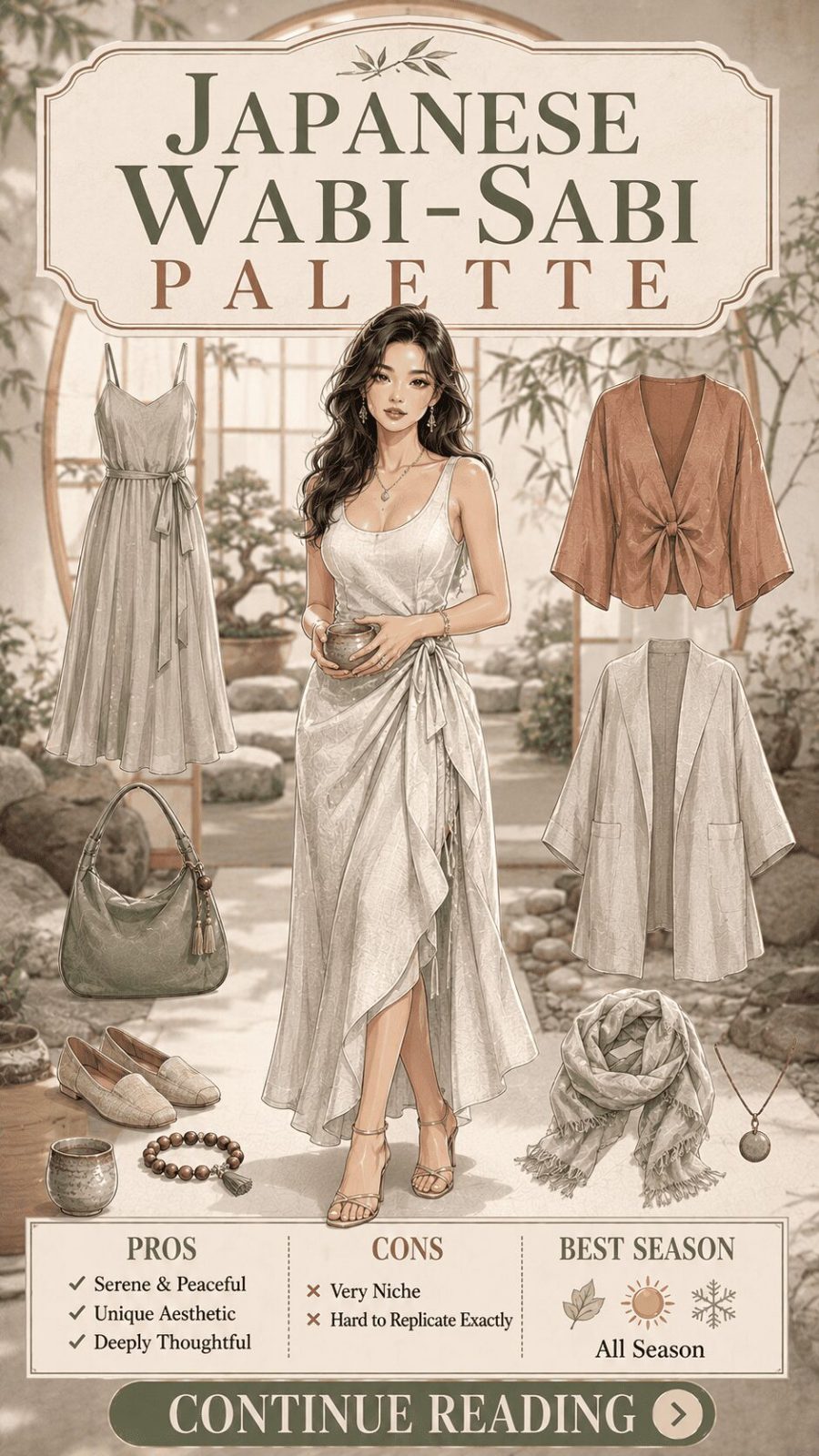
![Japanese Wabi-Sabi Color Palette Women's Clothing]()
Indigo, warm grey, clay, unbleached linen, charcoal, aged white — the colors of natural materials at the end of their transformation into something useful. The Japanese wabi-sabi aesthetic in fashion (expressed through brands like Issey Miyake, Yohji Yamamoto, and more recently through shibori-influenced contemporary brands) privileges asymmetry, imperfection, and incompleteness as visual virtues. The palette reflects this: these are not clean, perfect colors but complex, slightly irregular ones — indigo with variations from hand-dyeing, linen in the particular off-white of natural fiber, clay in the specific uneven tone of earthenware pigment. For the clothing types that embody this aesthetic most directly, our natural fabrics guide covers the textile foundations.
- 103
Moroccan / North African Palette
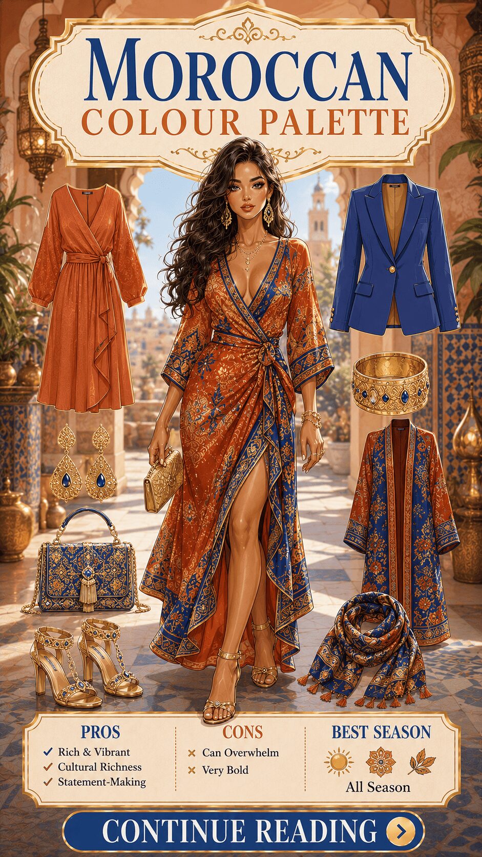
![Moroccan North African Color Palette Women's Clothing]()
Terracotta, vivid cobalt, saffron gold, warm rose, deep turquoise, and the sandy cream of sun-bleached stone. The Moroccan palette is architecturally a warm earth base punctuated by vivid, jewel-like accents — which mirrors the actual visual experience of traditional Moroccan architecture, where terracotta walls and sandy plaster are interrupted by glazed tile and mosaic in brilliant blue and turquoise. In fashion terms, this is the palette of maximalist resort dressing — warm, vibrant, and generous — combining beautifully with embroidery, embellishment, and flowing silhouettes. The kaftans and tunics that carry this palette most naturally are covered in our ethnic wear guide.
- 104
Indian Festive Palette
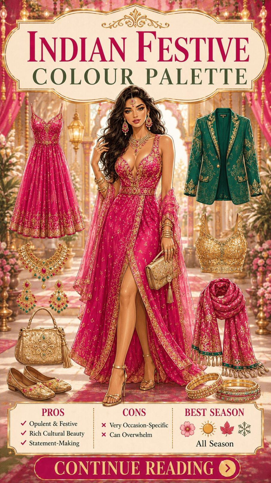
![Indian Festive Color Palette Women's Clothing]()
Magenta, deep emerald, royal blue, saffron, gold, deep ruby red, peacock teal — the palette of Indian wedding and festive dressing at its most saturated and celebratory. These are colors of maximum visual generosity — fully saturated, warm-biased, designed for the particular light conditions and social context of Indian celebratory occasions, where restraint in color is neither expected nor rewarded. Gold as an accent color (in embroidery, zari work, sequins) is architecturally essential to this palette — it functions not as a color in the chromatic sense but as a light-catching surface that activates adjacent hues. The garment types that carry this palette tradition are covered in our detailed festive outfits guide.


- Occasion palettes are partly about social codes but primarily about lighting — the environment the color must perform in
- Cultural palette traditions emerged from natural dye availability and regional light conditions — understanding origin makes borrowing feel respectful rather than extractive
- The travel palette prioritizes sustained wearability over photographic performance — a fundamentally different palette logic that most guides ignore
Category 7: By Trend Cycle (#119–#132)
Palettes defined by their place in fashion's trend architecture — from evergreen classics to micro-seasonal moments
- 119
Quiet Luxury Palette
![Quiet Luxury Color Palette Women's Clothing]()
Oatmeal, warm stone, dove grey, sand, pale camel, cream, and the occasional addition of soft navy or muted forest green. The "quiet luxury" palette — which became a dominant fashion conversation from 2022 through 2025 — is structurally a very particular version of the neutral palette: warm-biased, cashmere-adjacent in its associations, and explicitly anti-logo. The palette signals wealth through what it refuses rather than what it includes: no bright accents, no trend-driven colors, no visual noise. The chromatic restraint communicates that the quality of the garment itself is the statement. This remains one of the most commercially influential palette movements of the decade — according to Business of Fashion's trend analysis, the quiet luxury aesthetic drove significant shifts in contemporary womenswear sales from 2022 onward.
- 120
Y2K Revival Palette
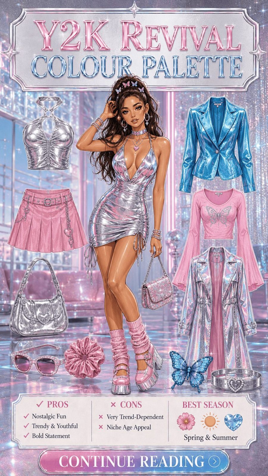
![Y2K Revival Color Palette Women's Clothing]()
Baby pink, electric blue, silver metallic, lavender, bubblegum, holographic iridescence, and the specific pastel-meets-neon combination that defined Y2K aesthetics. The Y2K palette is technically a collision of two palette registers — the sugary pastels of 90s pop culture and the techno-futurist metallics and holographics of millennium optimism. The revival that ran through 2021–2024 introduced these combinations to a generation encountering them as vintage references rather than contemporary trends, which changed their meaning slightly: worn with irony and nostalgia rather than earnest participation. For the outfit structures that carry this palette most authentically, our Y2K outfit guide covers the full look.
- 121
Dopamine Dressing Palette

Vivid, joyful, unapologetically saturated — citron yellow, hot coral, electric cobalt, vivid tangerine, bright fuchsia. "Dopamine dressing" as a trend concept emerged as a post-pandemic fashion response: a deliberate, almost therapeutic use of color brightness as mood elevation. The underlying color psychology isn't unfounded — research in environmental psychology consistently links high-saturation warm colors with elevated alertness and positive affect — though the relationship between wearing color and experiencing mood change is genuinely individual. What the trend did culturally was give permission to wear joy as a deliberate act rather than an incidental one. That's a useful reframe regardless of whether the neuroscience is as tidy as the trend name implies.
- 122
Dark Academia Palette
![Dark Academia Color Palette Women's Clothing]()
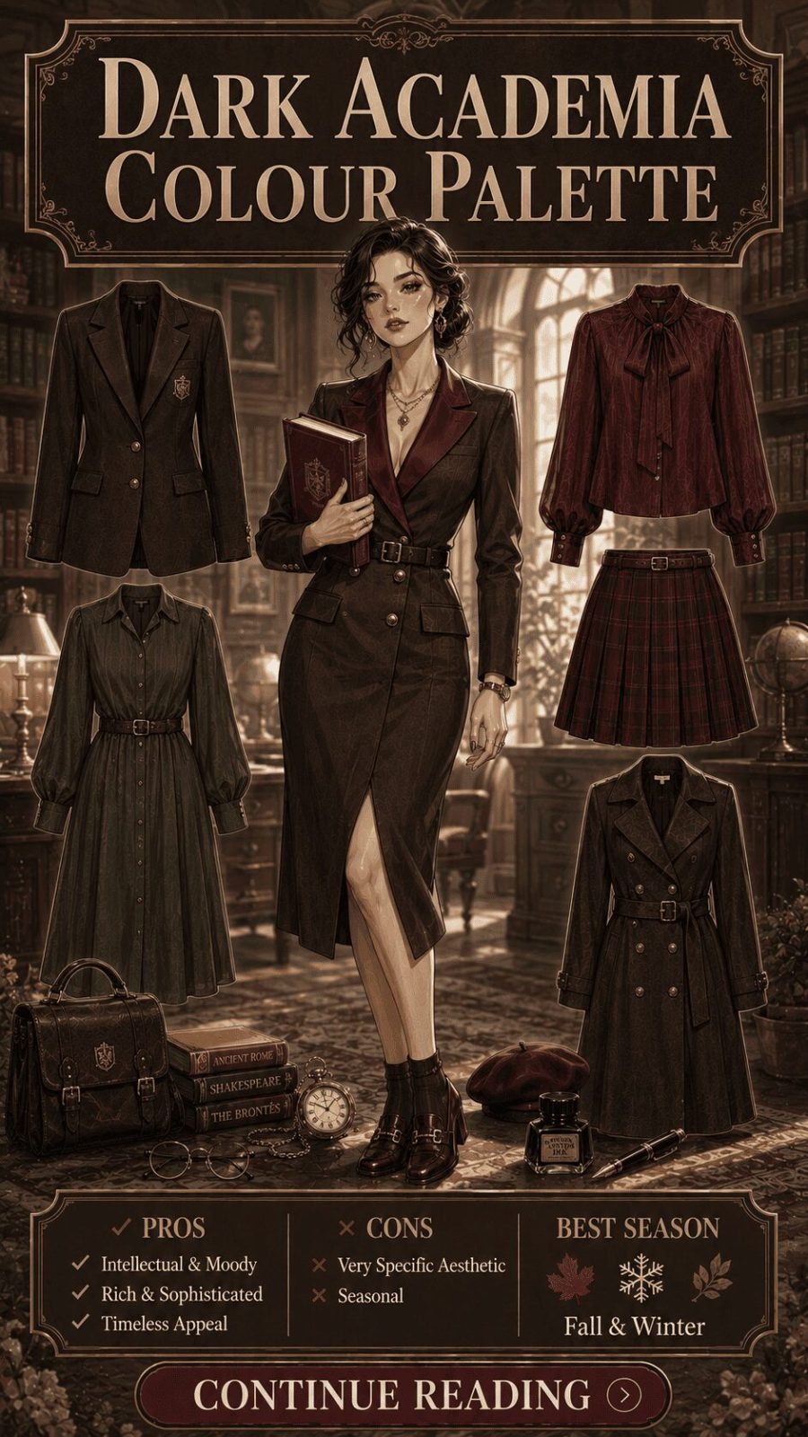
Oxblood, deep forest green, tobacco brown, charcoal, aged cream, mustard, and dusty plum — the palette of leather-bound libraries, autumn fog, and a certain deliberate intellectual earnestness. Dark academia as an aesthetic movement (which peaked on social media around 2020–2022 but has demonstrated genuine staying power in fashion-forward circles) draws heavily from British university dressing traditions, European literary culture, and the visual palette of Gothic literature. The colors are almost universally muted, warm, and heavy — chosen for their associations with age, knowledge, and indoor contemplative spaces rather than outdoor social spectacle.


Trend palettes come and go — but they often leave residue. The quiet luxury palette, for example, effectively normalized oatmeal and warm stone as investment wardrobe colors in a way that will likely outlast the specific trend label by years. Dark academia reintroduced oxblood to younger wardrobes. This is how trend cycles actually work with color: the specific trend peaks and fades, but the colors it normalised remain accessible. Build for the residue, not the peak.
Category 8: By Wardrobe Strategy (#133–#135+)
How color palettes function as wardrobe architecture — capsule building, outfit multiplication, and long-term investment logic
This is the category that most fashion content ignores — and it's arguably the most useful one in the entire guide. Understanding what a color looks like is straightforward. Understanding how color functions as a wardrobe strategy — how it multiplies outfit combinations, reduces decision fatigue, enables sustainable wardrobe building, and allows personality expression within consistent structure — is the skill that separates genuinely satisfying wardrobes from visually interesting but functionally frustrating ones. These palettes describe not just color choices but the logic behind them.
- 133
Capsule Wardrobe Palette

Two to three base neutrals with two to three accent colors that all work together — a deliberate chromatic ecosystem rather than a collection of individual preferences. The capsule palette strategy requires upfront palette definition: you choose your neutrals (navy + cream + warm grey, say), your accents (terracotta + sage), and then buy only pieces that belong to one of those families. The mathematics of outfit multiplication follow directly: with 5 tops and 4 bottoms all in aligned colors, every combination becomes a wearable outfit. That's 20 outfits from 9 pieces — versus a chaotic multi-color wardrobe where half the combinations don't work. For how this applies to specific garment types, our everyday basics guide covers the structural foundations.
- 134
10-Piece / French Wardrobe Palette
![French Wardrobe Color Palette Women's Clothing]()
Navy, ivory white, Breton stripe navy-and-white, camel, soft grey, and a single strong accent — typically a deep red, warm coral, or rich green. The "French wardrobe" palette concept (heavily romanticized in Anglo-American fashion media as a Parisian dressing philosophy) is built around maximum outfit multiplication from minimum pieces. The color logic is strict: every piece must work with every other piece, which in practice means an almost monochromatic neutral base with one signature accent that anchors the palette's personality. Functionally, it's a simplified version of the capsule palette — more aggressively edited, more reliant on quality of individual pieces, and more dependent on a signature accessory color to prevent uniformity.
- 135
Statement Piece Palette

One hero color or print piece surrounded entirely by supporting neutrals — the inverse of the capsule palette approach. Where capsule palettes are about total color ecosystem coherence, the statement piece palette strategy is about deliberate contrast: one item carries all the color energy while everything else steps back to let it perform. A vivid embroidered blouse against simple black jeans and white trainers. An emerald silk dress with nude heels and no accessories. The palette logic is subordination: all other colors exist to serve the statement piece rather than compete with it. This is, incidentally, one of the most reliable styling formulas for wearing very expensive or very bold individual garments without looking overdressed.
- 136
Transitional Layering Palette

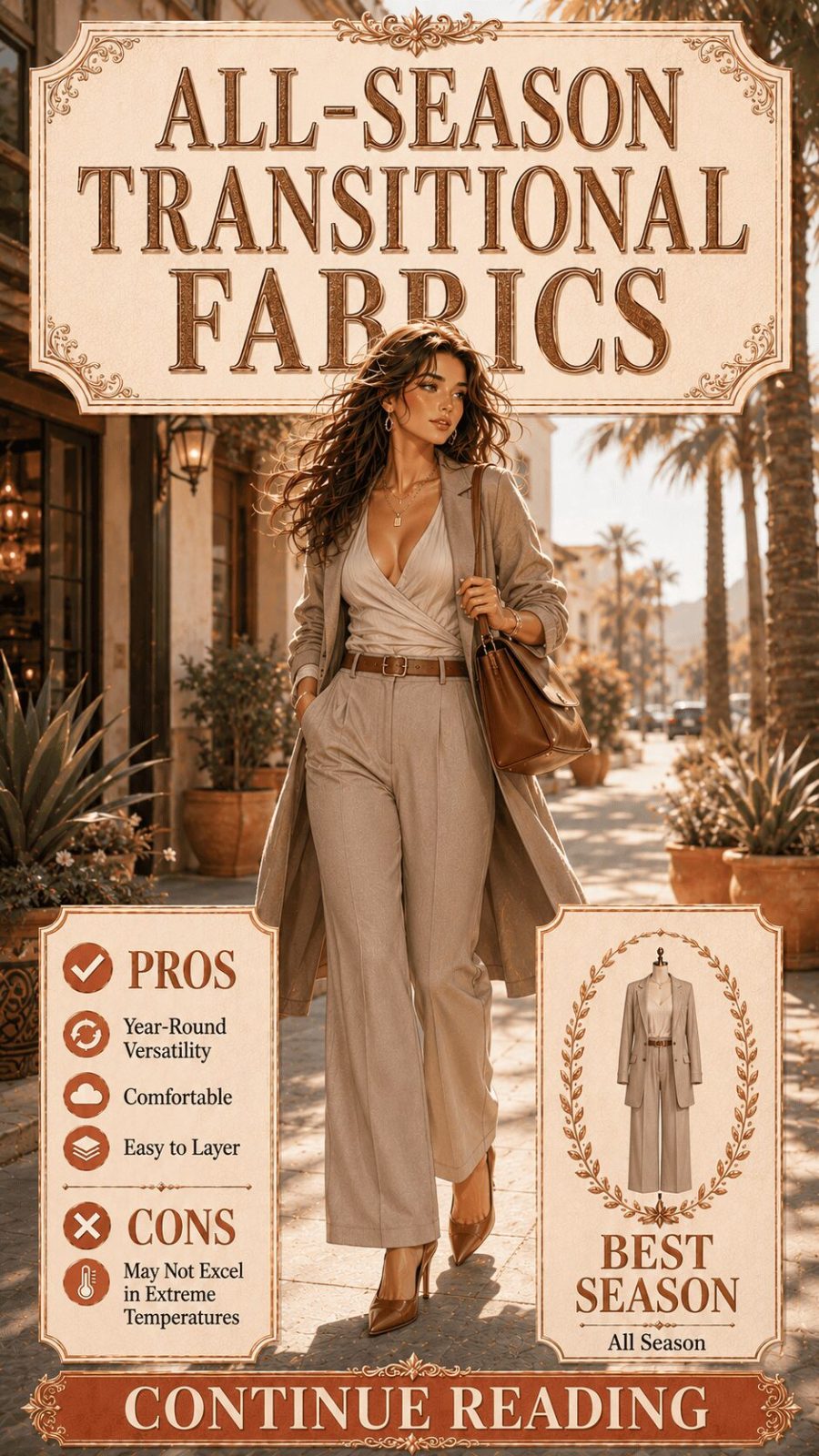
Warm neutrals, forest tones, and medium-depth colors that function equally well with summer-weight and winter-weight garments — the palette designed specifically for layering across temperature ranges. The transitional palette takes its name from the fashion calendar's problematic shoulder seasons (spring-to-summer, summer-to-autumn) when neither a full winter palette nor a summer palette reads appropriately. In practice, it means reaching for colors in the warm mid-range — rust, olive, burgundy, warm grey, deep cream — that work over a linen shirt in September and under a wool coat in November without requiring a full wardrobe recalibration at either point.

In wardrobe editing sessions, the single most common problem I find isn't poor taste — it's palette incoherence. A beautiful burgundy dress that works with nothing else. A bright yellow blouse with no neutral companions in the wardrobe. Isolated pieces that individually are lovely and collectively are unusable. The fix isn't to remove personality. It's to anchor it: decide your two base neutrals, choose two accent colors that work with those neutrals, and then let personality live entirely within that framework. The structure creates freedom, not restriction.
Frequently Asked Questions
The color palette questions most readers actually want answered — with direct, practical responses
What is the best color palette for a women's wardrobe?
There isn't a single best palette — but there is a most strategically sound approach: define two to three base neutrals (navy, camel, and warm grey, for example) and two to three accent colors that all work with those neutrals. This creates a wardrobe where every piece potentially works with every other piece, multiplying outfit options from a relatively small number of garments. The specific hues you choose should reflect your skin undertone, your lifestyle contexts, and your honest aesthetic preferences — not a prescriptive rule about what "flatters" you.
What is the difference between a neutral palette and a muted palette?
A neutral palette consists of colors with no dominant hue — beige, grey, black, white, and brown. A muted palette consists of colors that have visible hue identity but are desaturated through the addition of grey (technically "tones" in color theory). Dusty rose is muted but not neutral — it has a clear pink hue. Taupe is neutral — it has no dominant hue direction. Muted palettes tend to read as more sophisticated and complex than pure neutrals because the underlying hue identity creates subtle personality without the visual weight of full saturation.
How do I find my personal color palette?
The most reliable starting point is observing which colors consistently generate positive comments when you wear them versus which colors you feel you need to compensate for with extra makeup or styling effort. This behavioral evidence tends to be more accurate than theoretical undertone analysis. If you want formal analysis, the 12-season personal color analysis system (based on Kathryn Kalisz's Sci/ART methodology) is the most granular framework available and can be accessed through trained analysts. At minimum, determine whether you lean warm (golden, peachy) or cool (pink, blue, ash) undertone — that single determination resolves the majority of practical palette questions.
Can you mix warm and cool tones in one outfit?
Yes — and it's frequently done intentionally to create specific visual effects. The key is deliberateness: mixing warm and cool tones by accident tends to produce an outfit that looks slightly incoherent; mixing them by design (a cool grey blazer over a warm rust blouse, for instance) can produce striking contrast and visual interest. The clearest guideline: let one temperature dominate (roughly 60–70%) and the other accent. If the balance is genuinely equal, the palette tends to feel unsettled rather than intentionally complex.
What color palettes work best for office / professional dressing?
The most consistently effective professional palettes are: navy and cream (crisp, authoritative, adaptable); charcoal with a jewel tone accent (sophisticated, colour-forward without being distracting); and the warm neutral palette of camel, stone, and ivory (which reads as considered and premium under most office lighting). The practical principle: office palettes should perform well under artificial fluorescent or LED lighting, which flattens pastels and can make mid-saturation colors look washed out. Deep, clear colors and warm neutrals hold their quality better in this lighting environment.
What is the "quiet luxury" color palette exactly?
Quiet luxury as a palette is specifically: warm neutrals at medium-to-low saturation — oatmeal, warm stone, sand, ivory, dove grey, and soft camel. The defining characteristic is the absence of both bright accent colors and trend-responsive hues. No seasonal pop colors, no neons, no pattern-heavy prints. The palette signals quality through restraint: the assumption is that the garment's construction, fabric, and fit carry all the information. It's architecturally the palette of heritage brands like Loro Piana, The Row, and Brunello Cucinelli — labels where logo is absent and material quality is the entire message.
How many colors should be in a capsule wardrobe palette?
The functional minimum for full outfit combinability is four to five colors: two neutrals and two to three accents. The maximum that maintains coherent outfit-building logic is typically seven to eight colors. Beyond that, not all pieces will work together and the "capsule" logic breaks down. The critical rule: every accent color should work with every neutral in the palette — this is the test you apply before purchasing any new piece. If a color doesn't pass that test, it belongs to a different wardrobe ecosystem and creates an isolated piece rather than a combinable one.
What's the difference between a seasonal color analysis "season" and seasonal fashion trends?
Completely different systems. Personal color analysis seasons (Spring, Summer, Autumn, Winter) describe your skin undertone and natural coloring characteristics — they don't change and they're not about calendar seasons. Fashion trend seasons (Spring/Summer, Autumn/Winter) describe the calendar-driven collection cycles and the color stories that fashion industry trend forecasters develop for each commercial period. A person classified as a "Deep Winter" in personal color analysis absolutely can — and should — wear autumn fashion season colors if those specific hues align with the cool, deep, clear palette of their personal type. The systems are orthogonal, not competitive.
Conclusion: Color Is a Language — This Is Its Grammar
One hundred and sixty-five types. Eight classification systems. Palette identity, season context, and best-use purpose for every single entry.
What this guide does, ultimately, is hand you a vocabulary. And vocabulary in color is genuinely powerful — not in an academic sense, but in the practical sense that knowing exactly what you're working with allows you to work with it more deliberately. The difference between "I want something that feels sophisticated but not cold, with depth and some warmth" and being able to reach for a muted jewel-tone palette in warm amber and forest is enormous. One ends in frustration; the other ends in an outfit that actually works.
The framework here — tonal relationship, temperature, mood, personal color system, occasion register, cultural origin, trend cycle, wardrobe strategy — is the same framework that professional stylists, fashion buyers, and color consultants use to navigate color decisions professionally. It's not arcane knowledge. It's organized thinking applied to something most people treat as pure instinct. Instinct is valuable. But instinct informed by structural understanding is more reliable, more efficient, and ultimately more satisfying to act on.
Pair this guide with our deep coverage of women's dress styles, skirt types, and the complete color palette visual reference for the full picture.
- 135+ color palette types exist across 8 classification systems — tonal relationship, temperature, mood, seasonal personal color system, occasion, cultural origin, trend cycle, and wardrobe strategy.
- Tonal relationship is the structural foundation of any palette — the proportion rule (dominant 70%, accent 30%) applies to all color combinations regardless of which specific hues are used.
- Muted ≠ neutral: muted tones retain real hue identity with grey added — they're complex and sophisticated, not simply subdued. This distinction matters enormously in practical wardrobe building.
- Lighting context is an underrated palette variable — jewel tones deepen in artificial evening light; pastels wash out; warm neutrals read consistently across lighting environments, which is part of their wardrobe durability.
- The capsule palette strategy (2–3 neutrals + 2–3 accents, all interworking) is the most reliable approach for building wardrobes that generate maximum outfit combinations from minimum pieces.
- Cultural palette traditions emerged from natural dye availability and regional light — the Moroccan turquoise-and-terracotta combination, the Japanese indigo-and-linen tradition, the Scandinavian white-and-grey palette are all environmentally grounded, not arbitrary.
- Trend palettes leave residue — the quiet luxury palette normalized oatmeal and warm stone in mainstream wardrobes in a way that will outlast the trend label by years. Building from trend residue rather than trend peak is the most cost-effective approach.
- Personal color analysis (Spring/Summer/Autumn/Winter and their 12-season sub-types) is a useful starting vocabulary, not a prescriptive rule — it describes tendencies in undertone interaction, not absolute limitations on color choices.
- The statement piece palette strategy — one hero color surrounded by neutral support — is the most reliable way to wear bold, expensive, or very distinctive individual pieces without appearing overdressed or costume-adjacent.
Sources & Further Reading
- The Metropolitan Museum of Art — Chevreul and the theory of simultaneous color contrast; historical color theory in textile and fashion contexts
- Business of Fashion — Quiet luxury trend analysis and its impact on contemporary womenswear sales 2022–2024
- Vogue — Color palette wardrobing and the seasonal personal color analysis framework
- University of Fashion — Color wheel theory applied to garment and collection design; complementary, analogous, and triadic systems
- Encyclopædia Britannica — Color in Art and Design — Historical and cultural foundations of color meaning across traditions
This guide was compiled through analysis of color theory records, fashion history, personal color analysis methodology, and contemporary trend documentation. All classification decisions are editorial. Last reviewed: June 2026.